
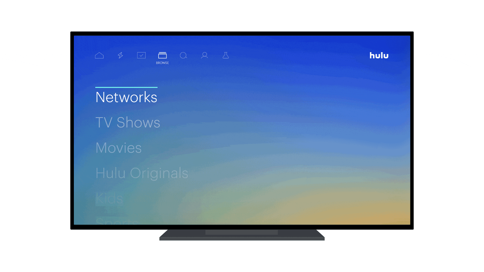
Hulu has one of the more ... creative and colorful schemes of the major streaming services. It's also not always the easiest thing to read. Form and function at odds, as they ever were.
But that's about to change a little bit. Hulu — as part of a push for better accessibility — is making the down-menu items less transparent. Which absolutely makes sense from a usability standpoint in 2019 — we've long since known that items running off the scren indicates that ther are more items to flip through.
In any case, here's what it'll look like:

The update will hit Hulu subscribers' screens automatically starting today on Roku devices. It'll come to Apple TV, iOS and Android in the weeks ahead.

Live & on-demand
All the TV you could ever want
Hulu has made a name for itself with a huge back catalog and stellar originals like The Handmaid's Tale. And now it's got a large stable of live channels — and it's fully integrated in the world of Disney and Disney+.
