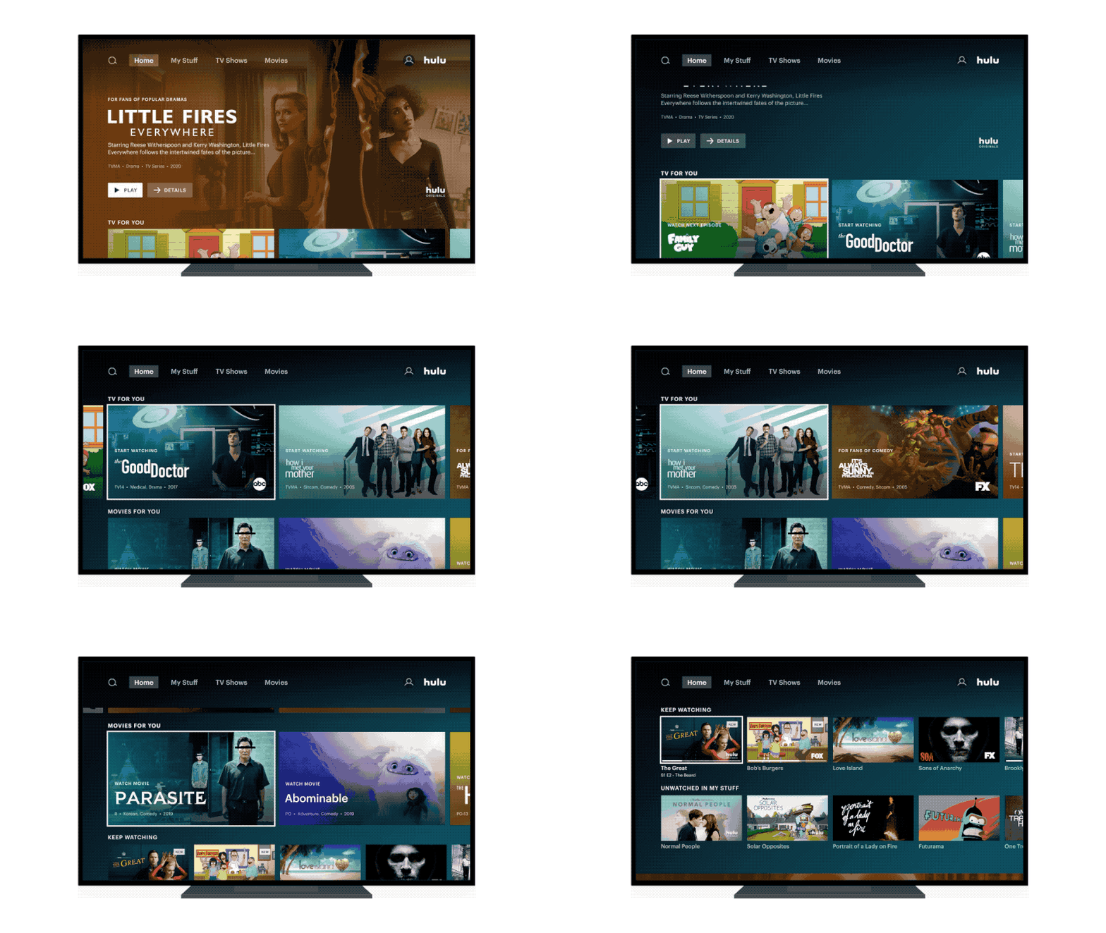
Hulu redesigns its user interface again, says you'll like it this time
It's coming to Roku and Apple TV first
The latest updates, reviews and unmissable series to watch and more!
You are now subscribed
Your newsletter sign-up was successful
Want to add more newsletters?

Hulu today announced that it's revamping its homescreen experience again — only this time it hopes it's something everyone will actually like.
The current iteration has been around since the spring of 2017. And while it generally looks nice, it hasn't been all that fun to actually, ya know, use. At the time, it was more about giving you access to the things you already knew you wanted to watch, and not so much about finding new things to watch. It was billed as "an easy-to-use, intuitive interface that seamlessly blends together live, recorded and on-demand content."
And users didn't really like it. Today, it's changing things up again.
Article continues belowFrom a blog post penned by Jim Denney, VP, Product Management, and Jason Wong, Director, Product Management:
With our growing audience, we're constantly thinking about creating the best possible experience for our viewers, by getting them to the content they want to watch quickly while also helping them discover their next favorite movie or series to binge. We listened to feedback from our viewers and heard they loved how easy it was to continue watching the shows and movies they love, but not as easy to discover new content.
The change also is to help bring things a little more in line with ESPN+ and Disney+, which, like Hulu, are under the Disney umbrella. (The three also make up the epic Disney+/ESPN+/Hulu bundle that's darn near impossible not to get.)
Hulu also says that it's improved collections by categorizing them vertically, and within them horizontally. Users also will notice new shows and movies will appear in larger titles, while "keep watching" tiles will be smaller. Recommendations also should be improved on the back end, helping you to see more of the content you'll actually want to watch.
The latest updates, reviews and unmissable series to watch and more!
The new user interface is coming to Roku and Apple TV today and will hit other devices "over the next few months."
- Hulu & Hulu Live TV Packages & Pricing in 2020: Channel List, DVR, Add-ons
- Best Streaming Devices for Hulu
- How to remove commercials from your Hulu account


