Costume and production design secrets from CBS All Access' 'The Stand'
Creating the Inferno, Randall Flagg's all-denim look, and more 'The Stand' design treats.
This post contains spoilers for The Stand.
From Boulder, Colorado to a revamped Las Vegas (or rather, New Vegas), creating the world of Stephen King’s apocalyptic The Stand is no easy feat. In the CBS All Access adaptation of this lengthy tome, the huge scale of this project was a massive undertaking for each department. Two very different approaches to rebuilding society require alternative visions baked into the fabric and it is vital to have a production and costume designer who can draw on the recognizable and the fantastic.
Leading a team of over 50 people in the costume shop, designer Angelina Kekich explains over Zoom that it was important to know the specific details of King’s text. After Kekich was hired, she recalls director Josh Boone giving her the novel saying, "We need you to go back and we need you to know this stuff inside and out. I need you to take the nine scripts and know it to the point of no tomorrow.” On a separate Zoom call, production designer Aaron Hayes also spoke about the source material and how he approached such a daunting project. “One of the things we talked about from the beginning is pick the things that are most important for the story and narrative the showrunners wanted to tell,” he says. “Try and find a way to put the most into the sets and locations to show scope and scale, and then try and get intimate with the others.”
Kekich shares mood boards and illustrations that give further insight into the process, while Haye’s behind the scenes production design photographs offer a glimpse into the scale of this epic mini-series. Here, Haye and then Kekich talks us through the different costumes and design focusing on the recent explosive (quite literally) episodes while offering some light hints regarding what is to come.
Easter Eggs
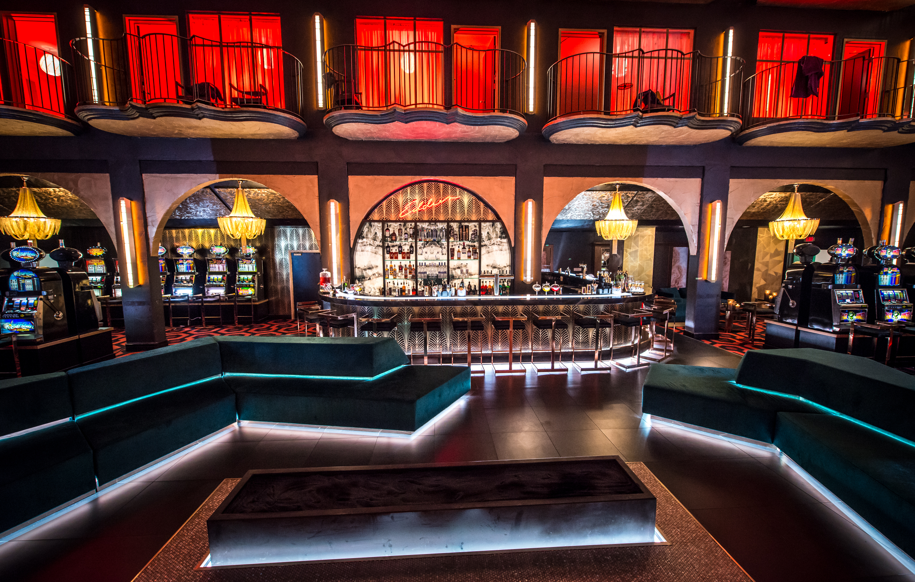
Adapting a beloved novel from an author with as much pop culture penetration as Stephen King gave Haye the opportunity to pay homage through visual references. Some of these include a very famous carpet pattern, while others are for die-hard fans to discover. "I talked to the showrunners and said “I really would like to just fill this world with as much Stephen King nods as possible,” explains Haye. “There are references everywhere, whether it's a label on a beer bottle to the cards being dealt in the casino to you'll actually see Stephen King himself.” Another area that offered this opportunity is Harold’s (Owen Teague) bedroom and every poster and book choice is purposeful (director Boone picked the individual books on Harold's shelf). Randall Flagg’s (Alexander Skarsgård) presence lingers from the King Crimson poster to a scorpion. “The Crimson King is of course a recurring villain in the Stephen King pantheon related to Randall Flagg,” remarks Haye.
Building the Inferno
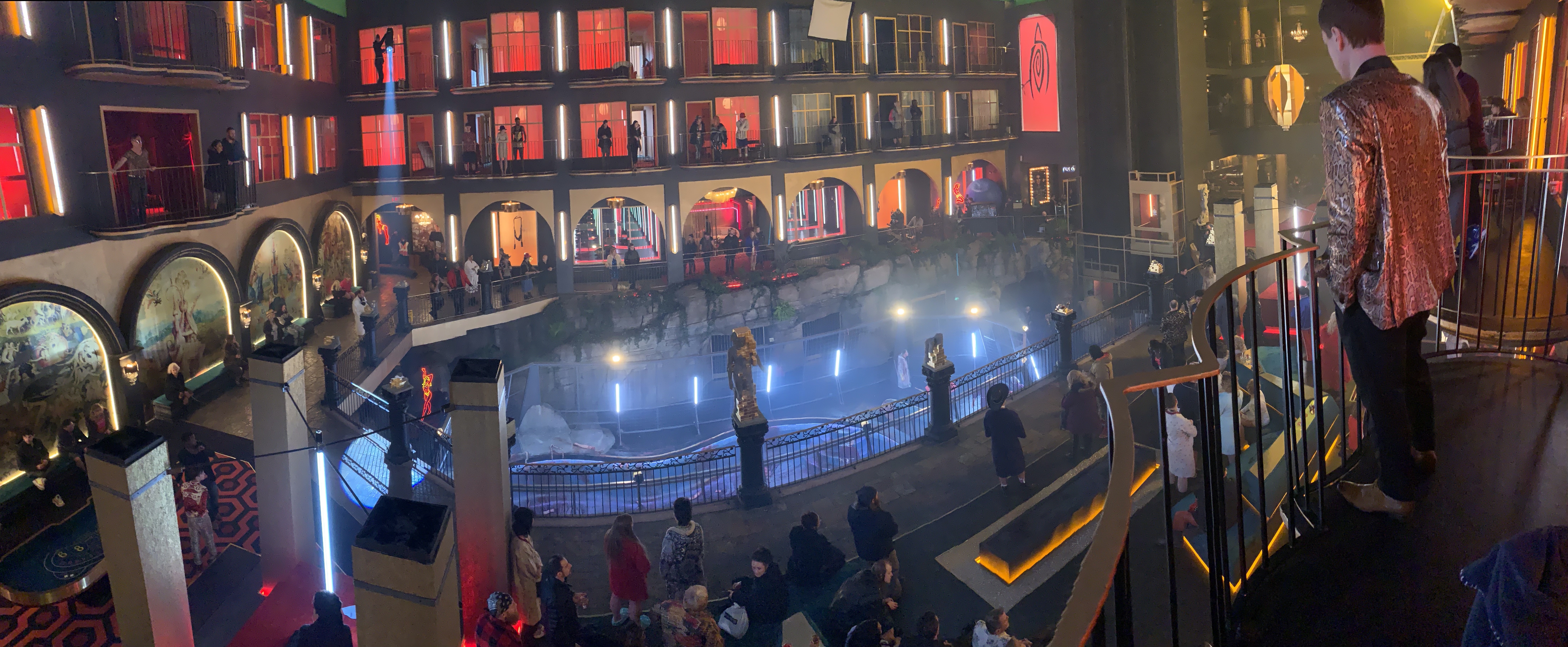
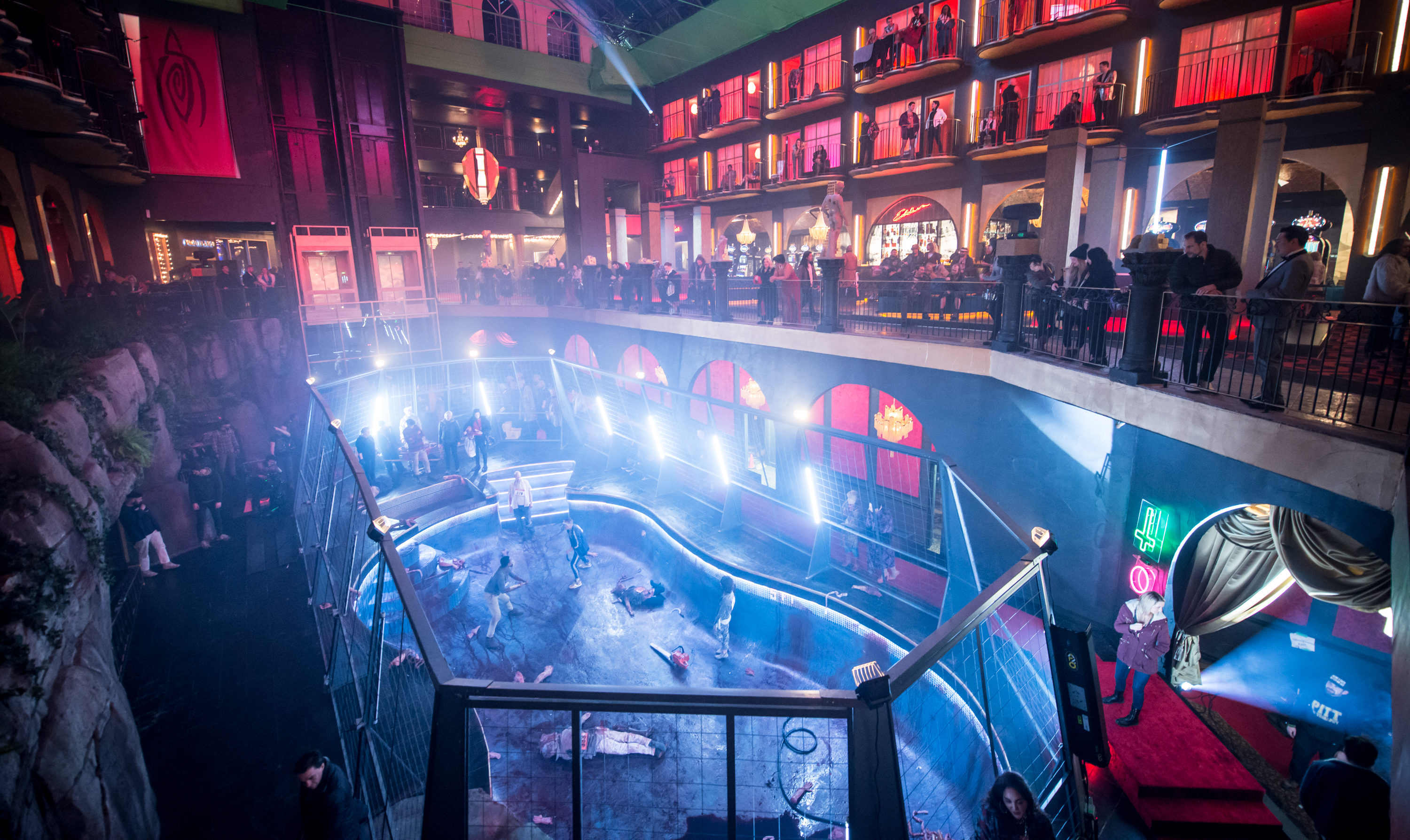
How do you find a hotel big enough to turn it into Randall Flagg’s New Vegas playground? First, you have to find a closed down location with the perfect layout to transform. For the Inferno, Haye and his team scouted both Vegas and Canada for potential casinos. The location manager struck gold when he found an empty spot that had an atrium fit for Flagg’s followers. "Oh my god, this is the ugliest place I've ever seen," was Haye’s first reaction to the pink (inside and out) five-story high spot. “I thought "Wow! This is horrible but, boy, could we do something fun with this." Returning to the building with the producers he began to pitch ideas including turning the pool into the fighting arena. “We went for that and we gutted the entire place. We were able to do an exterior finish, so you could actually drive up in the car [and], which you'll see in the next episode,” he teased. “We basically had five floors of functioning set, hallways, suites, the execution gladiator pit. Then we built the bar, built the casino floor — all that stuff was from scratch — and we also had sort of retail shops,” he says. “On the biggest days, we probably had 250 extras in that space.”
Because they were doing so many alterations to the building — including taking walls out — there was some concern about the engineering of the building. “We managed to pull it all off, and I think it's really over the top, it's very garish it's very vibrant colors.” He points out that this isn’t necessarily the palette he would have picked if he was doing it from scratch but it also speaks to the Vegas over-the-top aesthetic.
The latest updates, reviews and unmissable series to watch and more!
Lloyd's Suite and the Elevator
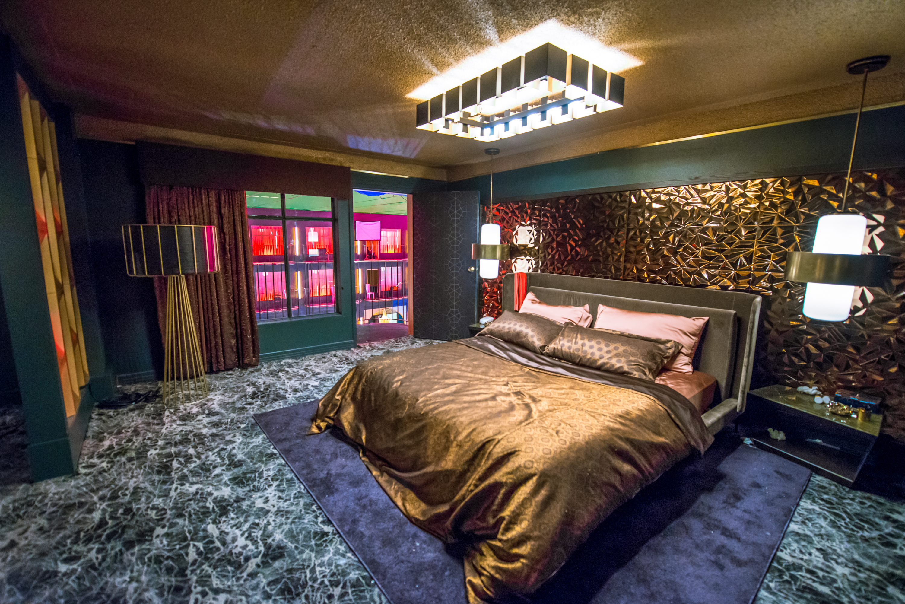
One of the features in this empty hotel that offered instant inspiration was the functioning glass elevator that Randall redecorates in “The Vigil.” “With a practical elevator we can go up and down five floors, we can actually go from that elevator to Lloyd’s (Nat Wolff) suite, we can walk through Lloyd’s suite, and then look out over the balcony and see the carnage that's taking place below,” says Haye. This helped plan the “Welcome to Heaven” moment in Episode 5: “There was a wonderful visual effects moment where the camera goes out one door and pans over so we see, and then we come back and find Lloyd and the girls standing on the balcony.”
Flagg's Parasitic Design Influence
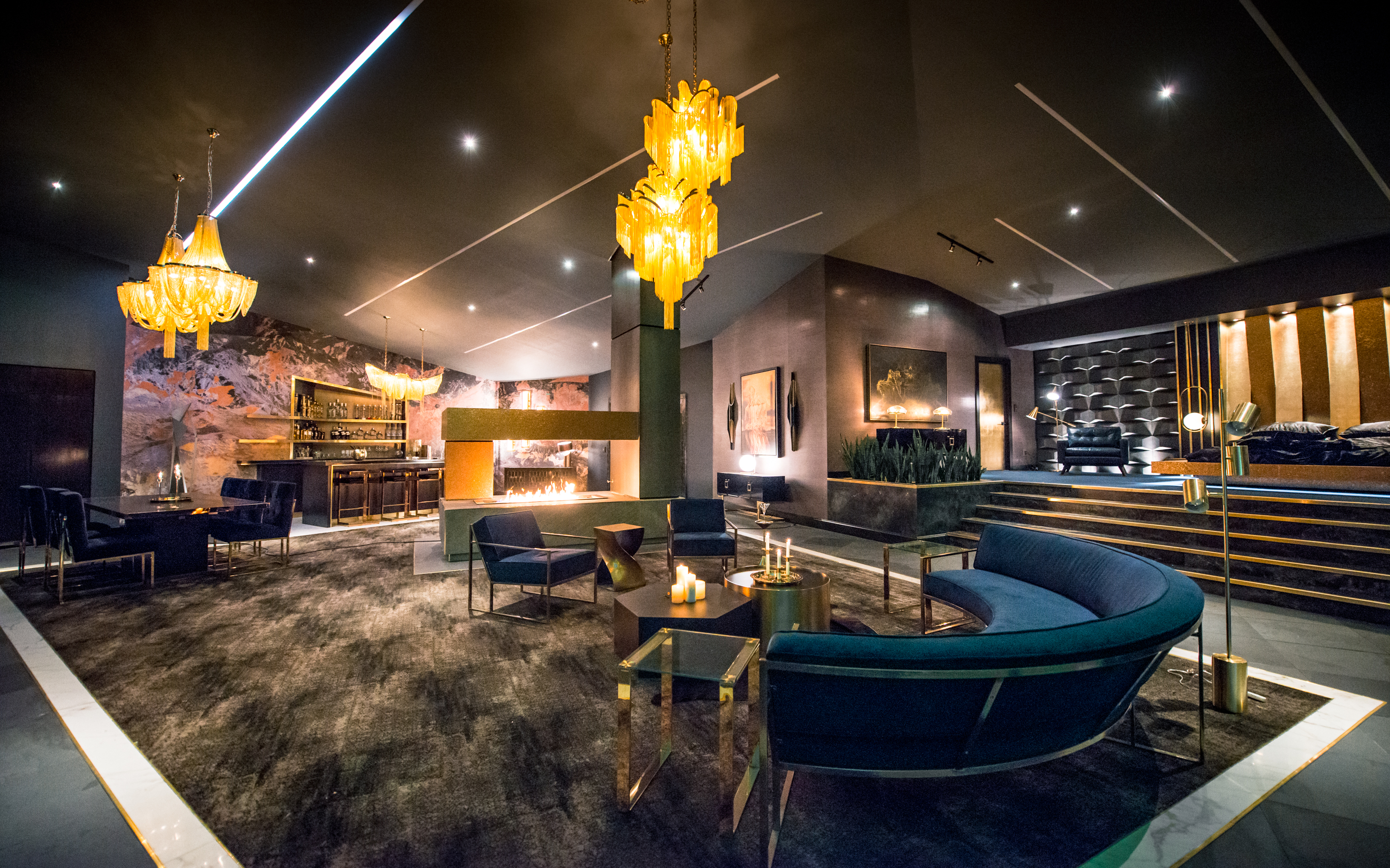
The exterior shots of Las Vegas are the real city with VFX to show Flagg’s all-encompassing influence on this building. Noting that this building exterior is Planet Hollywood on the strip and that Caesars Palace (who own this casino) let them shoot the required plates. “We decided to take this parasitic architecture approach where these shards of glass were shoving out through the top and a slash of glass through the façade,” says Haye. “And that was meant to echo the way he parasitized vulnerable people. There may or may not be parallels to contemporary political situations.”
“We had an incredible visual effects team. Jake Braver led that and then we had Industrial Light & Magic doing a lot of effects work, really came off beautifully,” says Haye. A full-circle moment for the production designer who worked for ILM in 1995 and he originally came from practical miniature effects.
Real Cornfields
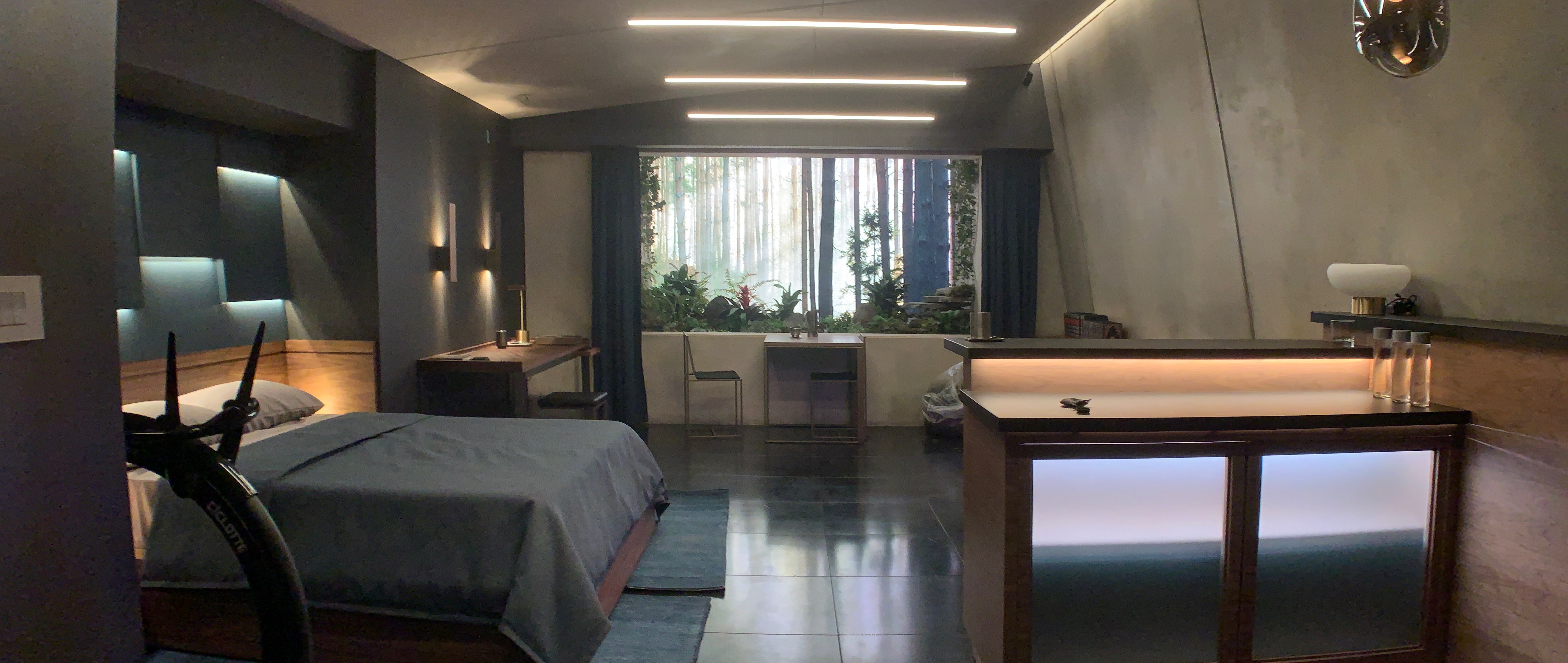
"We basically grew a massive cornfield,” is the simple answer to the Mother Abagail (Whoopi Goldberg) dream location. Haye teases it “will relate to Episode 8 and 9, you'll see a little more of that.” Corn crop circles were built in cornfields for the dreamscape conversations and it was important to use these moments to puncture reality and in some cases, there were practical reasons to consider. “When Stu (James Marsden) is in the in the Stovington quarantine facility and he's got that artificial window that was partially designed to allow us to have some exterior light in an underground bunker,” he says. This was to provide comfort to the lucky few sequestered in this space while the horrors occurred above ground. “But we also wanted to be able to have that cornfield appear. So we tried to make that practical as well as an extension,” he describes. “We actually planted a cornfield outside that window, had a projection screen, and crawled through it into our location se
Mother Abigail's House

When asked what his favorite set was, Haye mentioned an overlooked and simple location. Mother Abigail’s entire house (both interior and exterior) was constructed from scratch “because we had to blow it up.” Built on a cul-de-sac in Vancouver, the production designer described it as “a fun one because I wasn't sure if we’d get it done but our construction team was amazing.” After I replied how real the explosion looked, Haye laughed as he said “That's because we really blew it up.” Putting his miniature experience to use, they also built a very large scale miniature to blow up “that VFX stitched together and enhanced.”
Frannie Goldsmith
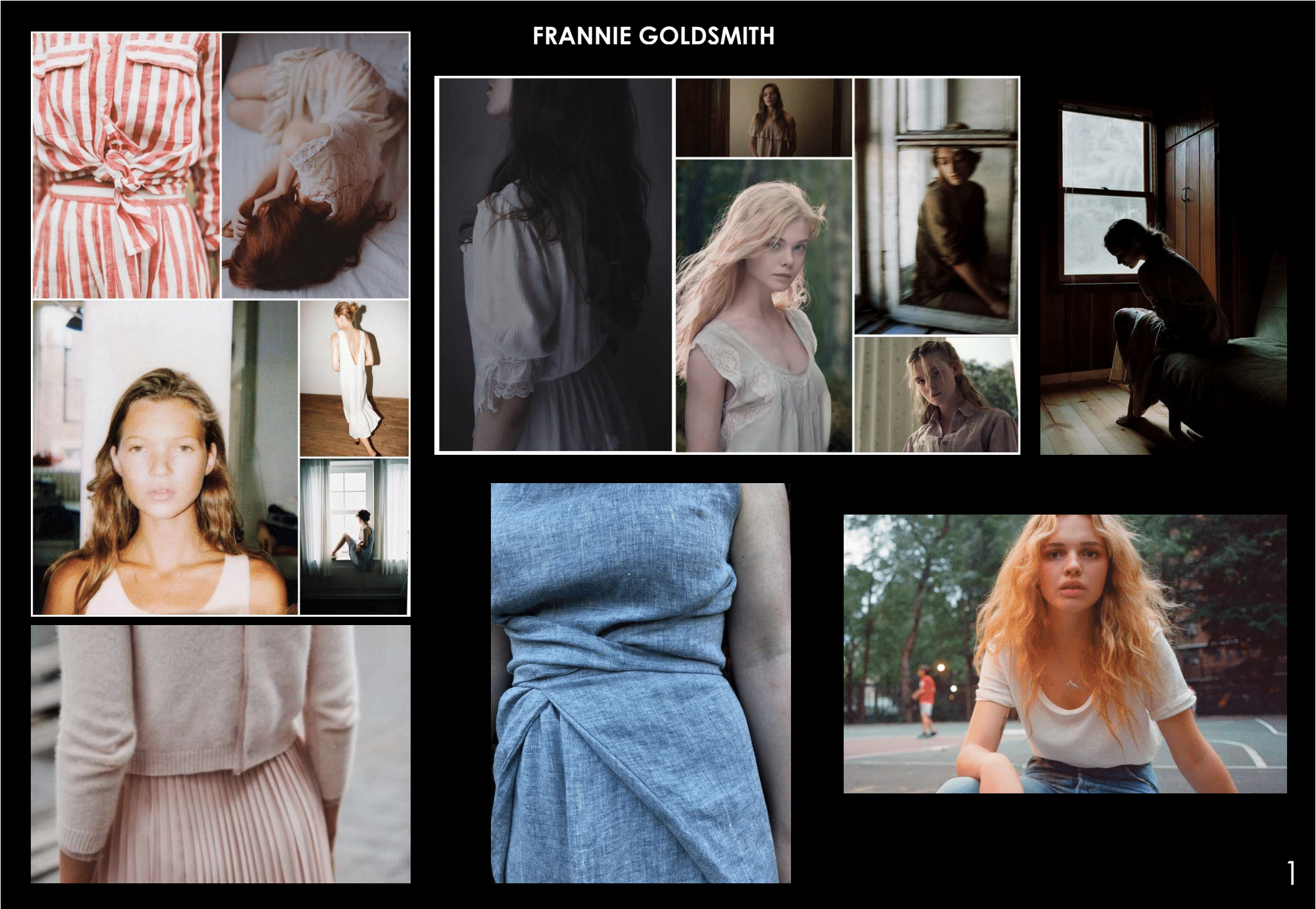
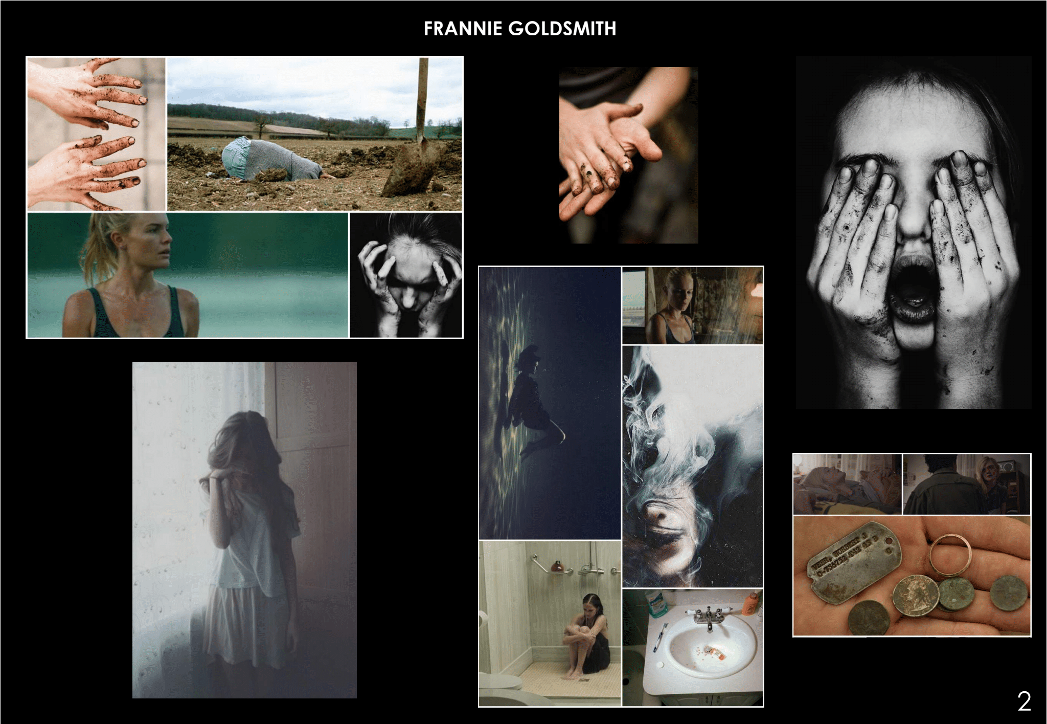
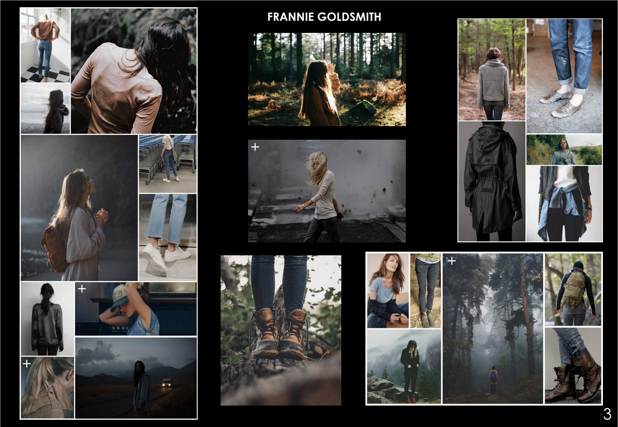
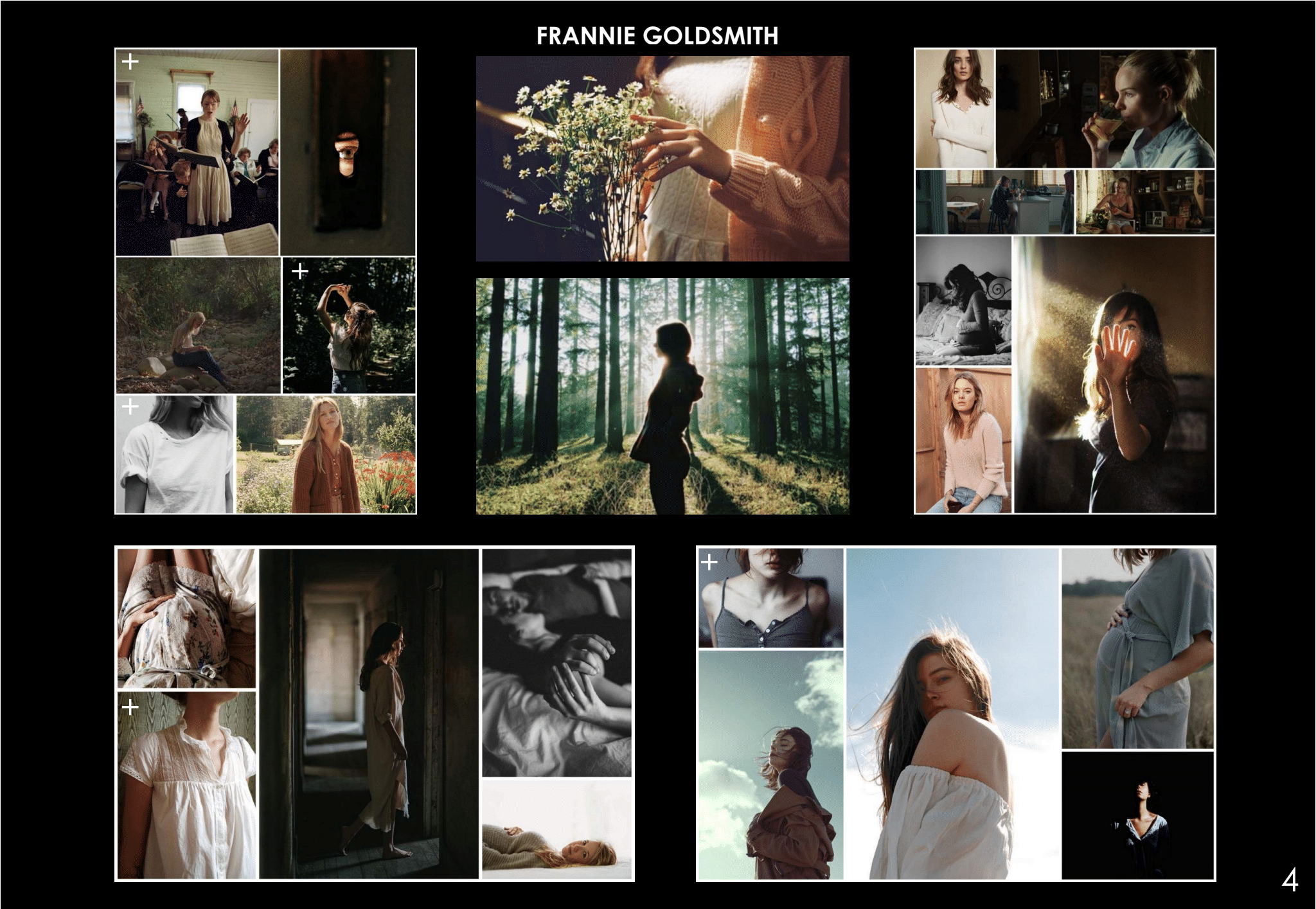
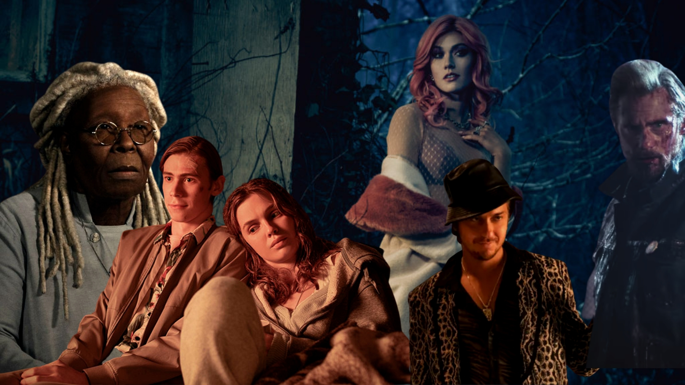
When crafting this many costumes across a non-linear narrative it is important to know your timeline. Working with Los Angeles based visual consultant Allison Klein, Kekich explains they “spent 10 weeks creating this timeline and journey of each character.” Using Harold and Frannie (Odessa Young) as an example she references the different stages of their storyline from pre-pandemic to Boulder. “We looked at their emotional, mental [and] physical state of who these characters are.” Creating visual boards (that topped a whopping 500) was particularly important because of the production schedule. Shooting the premiere and finale first meant the entire arc had to be known inside out. “In order to do the rest, you had to know everything,” she says. To achieve this, Kekich worked 14/15 hour days with her team, “We spent four or five hours every day sitting in a room with my assistant designers and coordinators discussing each of the characters: ‘Why is Frannie like this?’" They would use King’s novel and the script to support their choices, ‘How do we see this happening? What is her emotional state? How do we want to project this?’"
Frannie’s Mount Rushmore sweatshirt is a practical decision worn during her travels, which was also symbolic. "We thought that she picked it up at a corner store in their travels. And what's better than to have all the former presidents on the front. It was trying to find pieces when you're traveling,” says Kekich. “Where are you stopping?” A favored garment — Kekich points out she owns this shirt — it was also a big hit with Young. “It was a piece that I felt was really Frannie and Odessa loved it,” she adds.
Harold Lauder
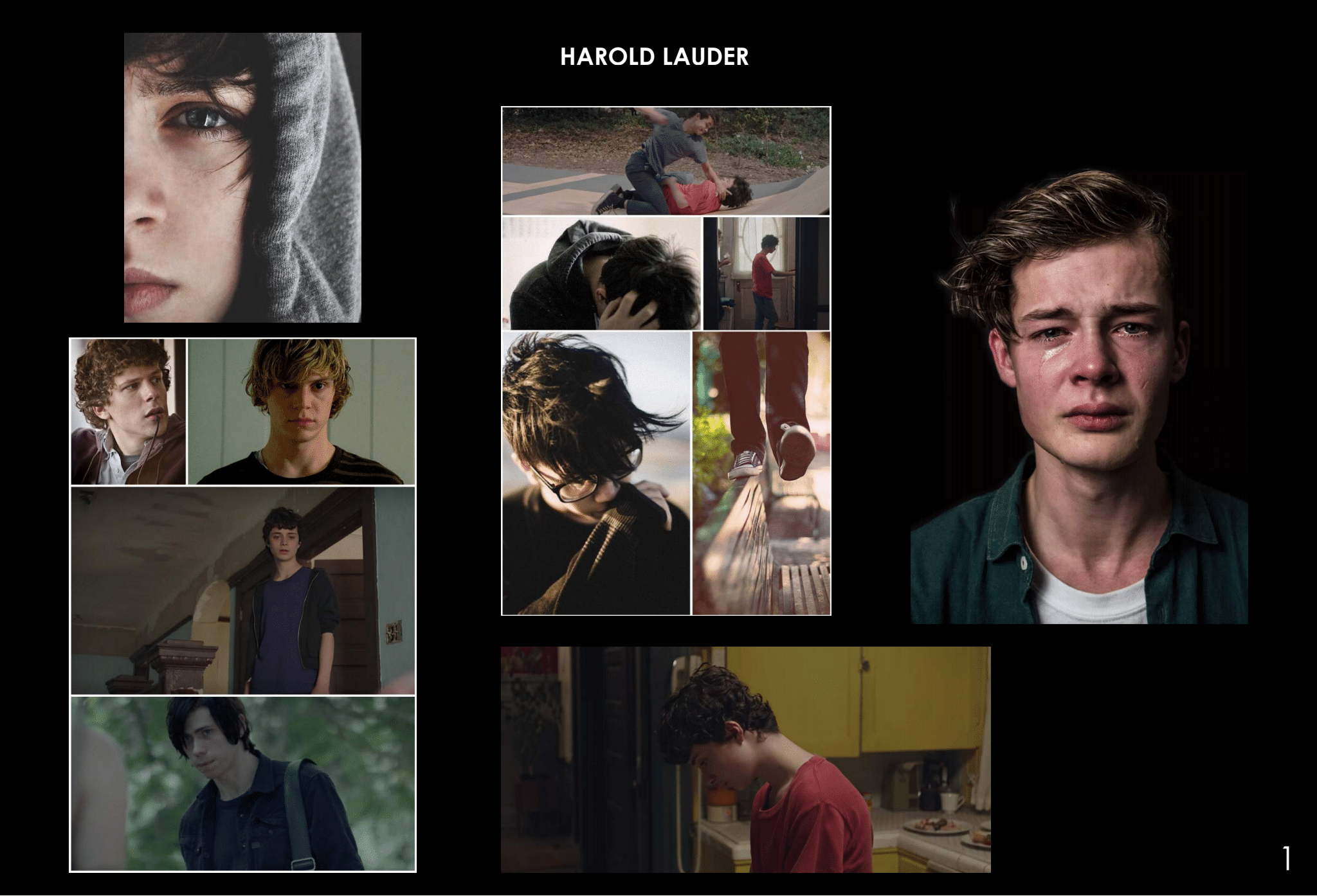
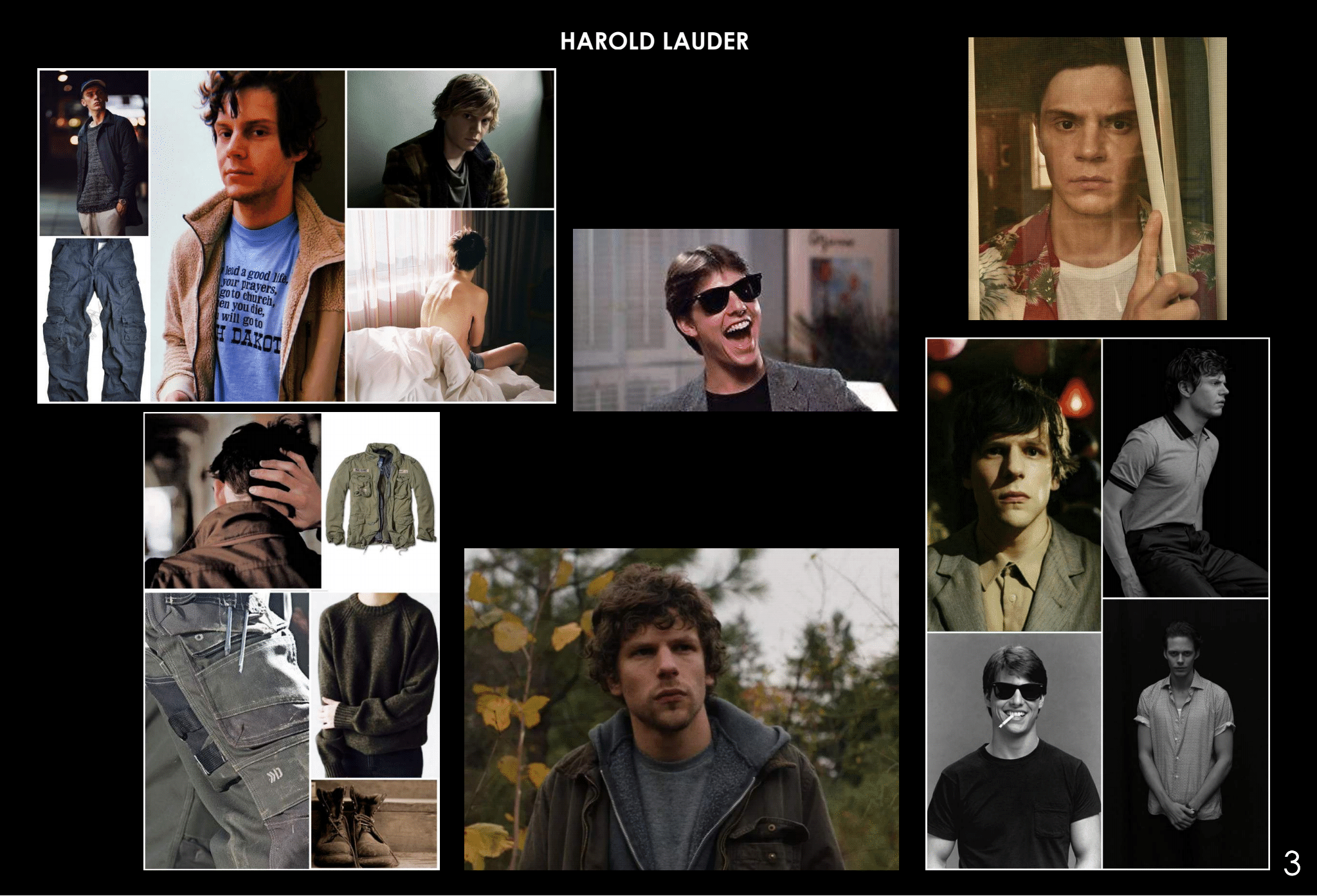
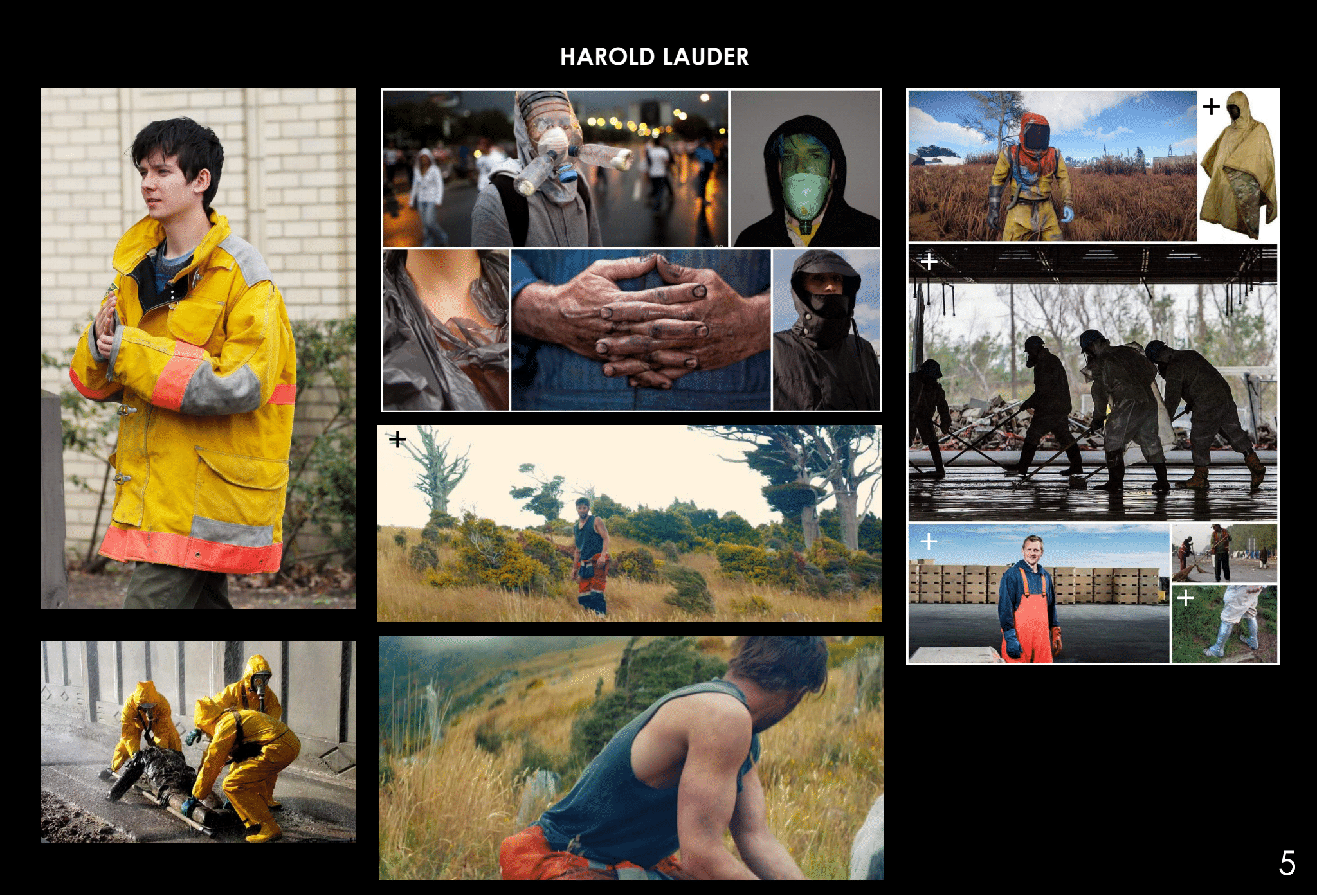
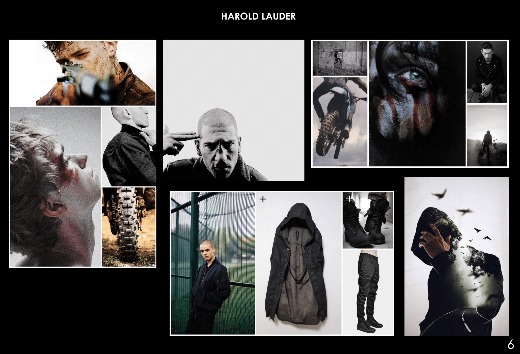
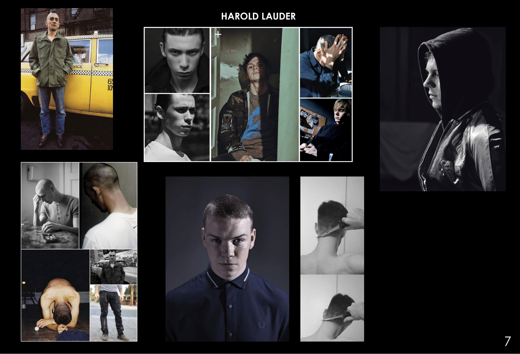
While most of the new Boulder residents opt for clothing they wore pre-pandemic — think Larry’s (Jovan Adepo) leather jacket, Stu’s plaid shit — Harold has gone on quite the costume journey. To depict Harold’s outsider and isolated status in the first episode, Kekich dialed up certain elements, “There is an awkwardness to him, there is a lack of self-esteem. And there's a simplicity to the costumes and has a bit of a child-like feel to it.” After he realizes that his boyhood crush is the only other survivor in their town he takes a bolder approach (no pun intended). Working closely with Teague, Kekich explains, “There had to be a sense of awkwardness but also a sense of where his esteem is. And for us, it was these pastel colors.” Referencing the eye-catching black patent boots and pastel Hawaiian shirt, she comments, “It would not be the world that most people would but this was his way.”
Arriving in Boulder, his attire shifts again as his confidence slowly grows. "We don't see this little boy we saw in Maine, we see this person who has a purpose in Boulder,” notes Kekich. He has struck up a friendship with Teddy Weizak (Eion Bailey) but there is still artifice to his presentation represented by the actor he tries to emulate. “This is Tom Cruise thing, trying to gain the smile and trying to gain a relationship with the people of Boulder. The fakeness of it in-between and trying to be something that he's not,” she adds. One final shift sees him embracing a more menacing aesthetic after he gets involved with Nadine (Amber Heard) and finds out the Dark Man has a purpose for him. “We show it in color palettes. We show it in these light colors,” she observes. “And then we go into a more muted and a much darker palette.” Summing up not just Harold’s trajectory but her process creating The Stand costumes as "It's looking at the emotional, physical and mental minds of these characters and trying to develop something that's realistic so that people don't go ‘Oh, this is just another stylistic show.’”
Randall Flagg
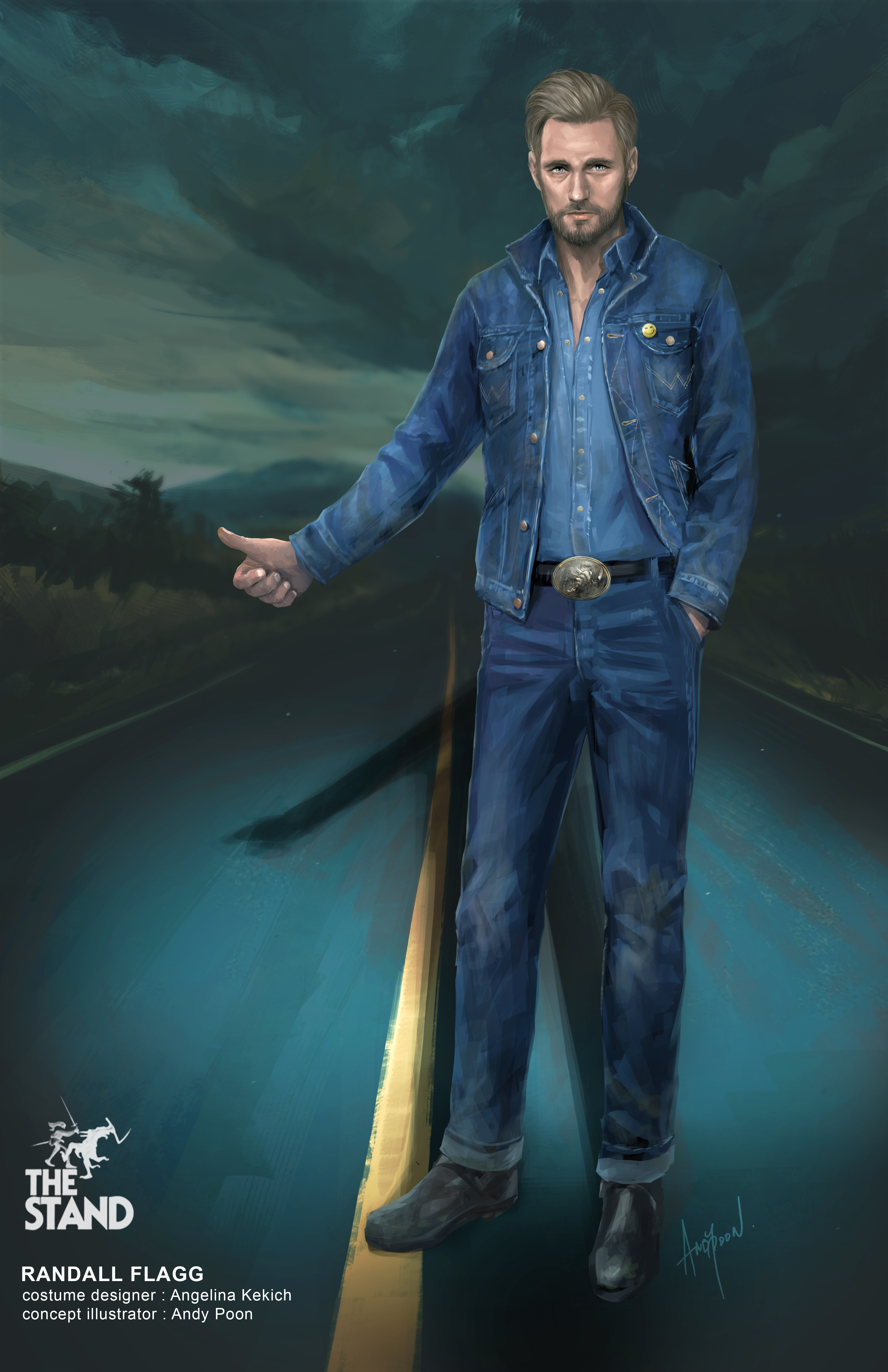
Creating a signature antagonist look can be a high-pressure situation, but even more so when this is the only costume Stephen King has to approve. "The one thing that had to stay true was Randall Flagg/Dark Man,” Kekich remarks about the 30 years of artwork they looked at before conceiving this costume. Referring to the infamous Canadian tuxedo — the Vancouver-based designer points out that Skarsgård signed her illustration "To Angelina, the best costume designer, love my Canadian tuxedo" — she says it was important to also modernize the look.
The process from Skarsgård getting to receiving his measurements, and presenting the denim-clad results was 48 hours. Because they had done their research and looked at a lot of artwork, as well as the Dark Man back history it meant they were prepared. Additionally, Kekich had put together six mood boards (some of which you can see below) that depicted different types of denim, as well as breaking down the aging process — this is very important when covering the different stages of Flagg’s life over the nine episodes. Teams in Los Angeles, New York, and Vancouver were sourcing garments for “an extremely tall man, who's got to wear a jean jacket, jeans shirt, jean pants.” After the team arrived back in Vancouver, collectively she estimates that they had “30 different jean jackets, at least 40 or 50 pairs of pants. We had probably about 30 different boots.”
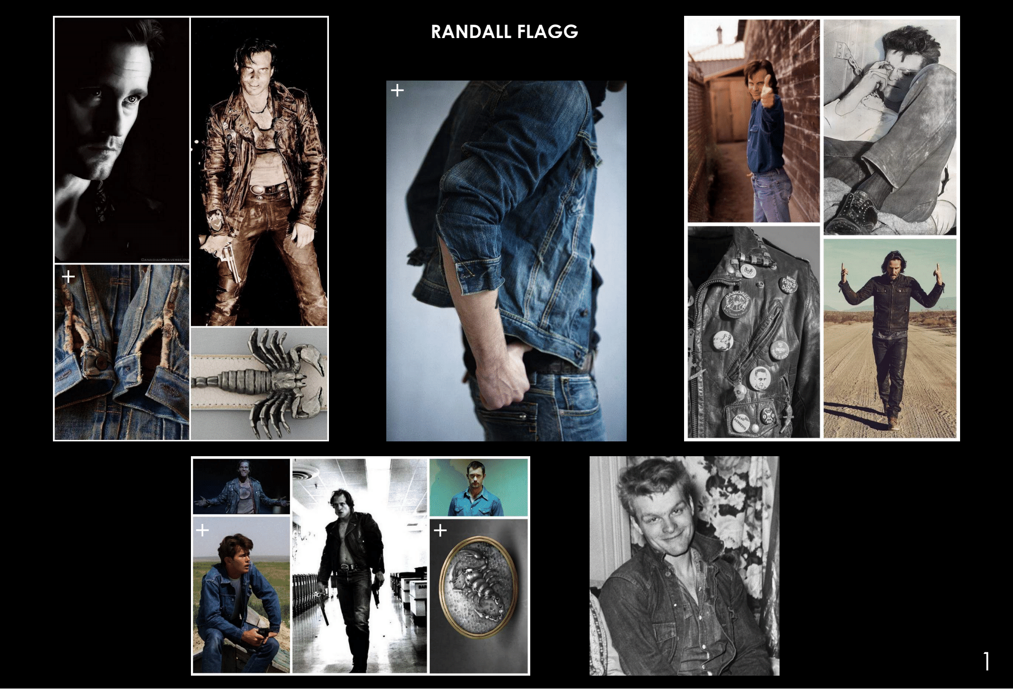
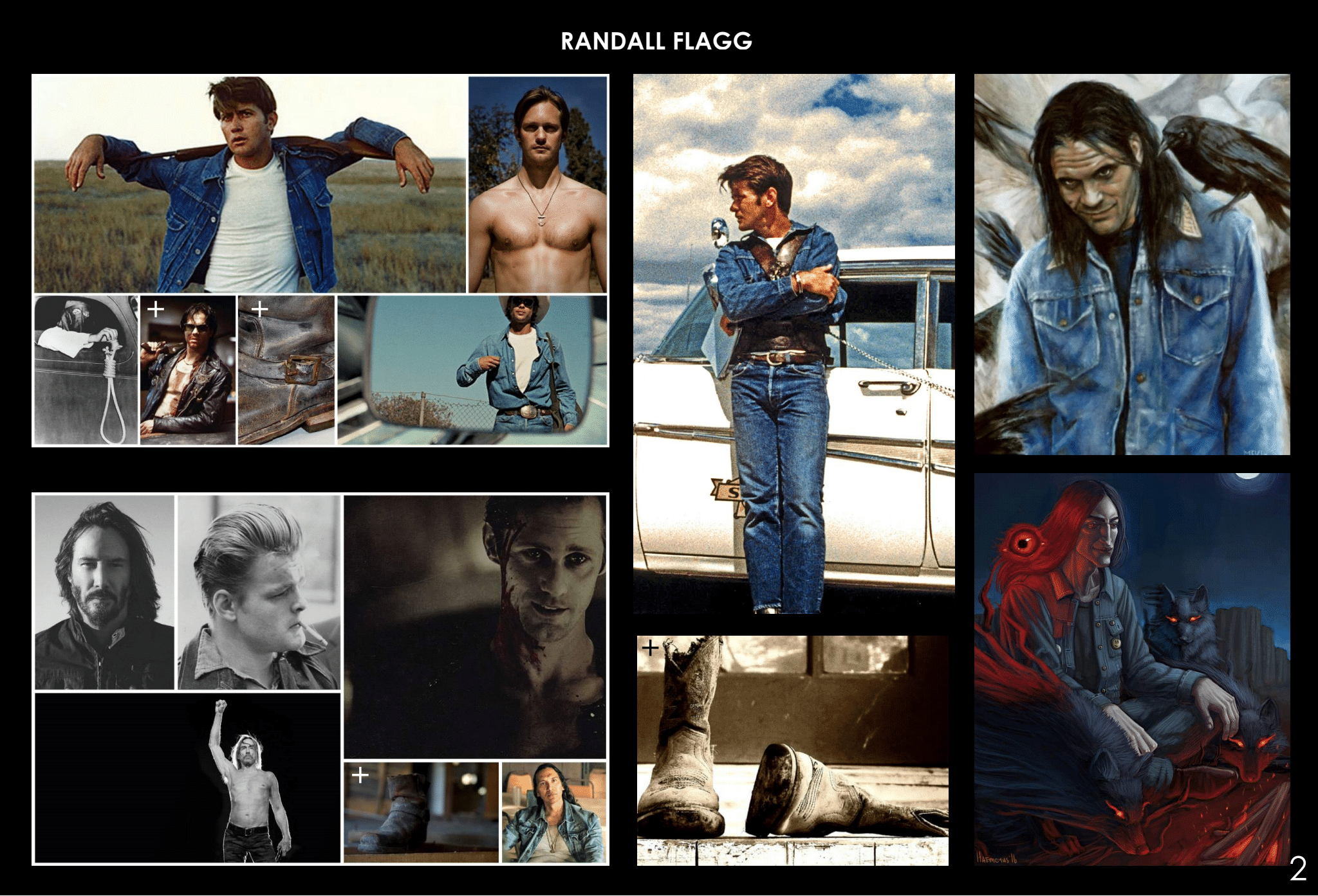
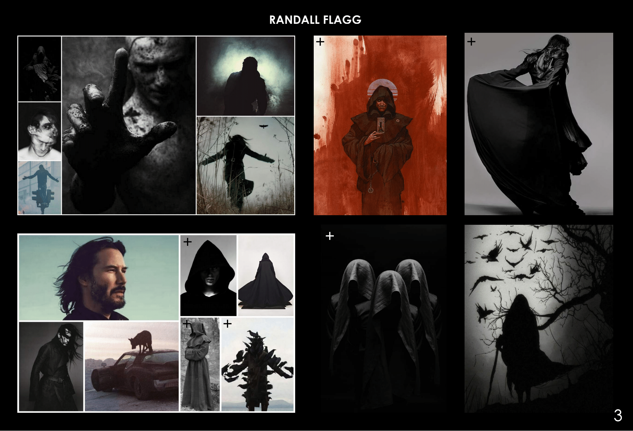
When Skarsgård came in for his fitting Kekich recalls, “He couldn't believe how much we had. We had different gradients, we had different styles all the way to vintage denim.” Before this fitting, she had already discussed the concept with the actor “making sure we were both on the same track.” Skarsgård picked out a selection of items and when he came out, Kekich remarks that “It was almost like the gods were with us. It was almost perfect. We had Flagg!” They rolled the cuff, flicked the collar, and did some minor alterations to “give it a little bit more of a sleeker look.” Referring to it having a little “bit of a rockabilly feel, but modernized” she wanted to have a bad boy rock and roll vibe. Photos of this version were snapped and she asked if he wanted to try on anything else. Skarsgård was happy with this ensemble and Kekich emphasizes how unusual it is to get a fitting of this kind done so quickly. It took 25 minutes when they had scheduled a five-hour fitting.
Before they could celebrate, they had to get the golden seal from King, Boone sent a photograph to the author. “The next thing we knew we got an approval from Stephen saying congratulations and I remember I finally went to bed,” she exclaims. The process wasn’t over and she estimates they ended up with approximately 60 pairs of pants, 30 jackets, and 30 shirts. This is to account for the stunts, photo doubling, and different stages of blood, which took the aging team about five months. (“Don't forget we're dealing with hundreds of costumes” Kekich points out that it wasn’t just wall-to-wall denim) “We had about 15-20 people in the breakdown team, aging these costumes on a regular basis,” she added.
The Scorpion belt is custom made by Vancouver-based designer Andy Poon, whereas the smiley face button was a team-up between props and VFX supervisor Jake Braver. “We built three costumes for Flagg. You've seen two of them: Dark Man and his denim look. You've got another surprise coming,” teased the designer
Flagg's New Vegas Followers
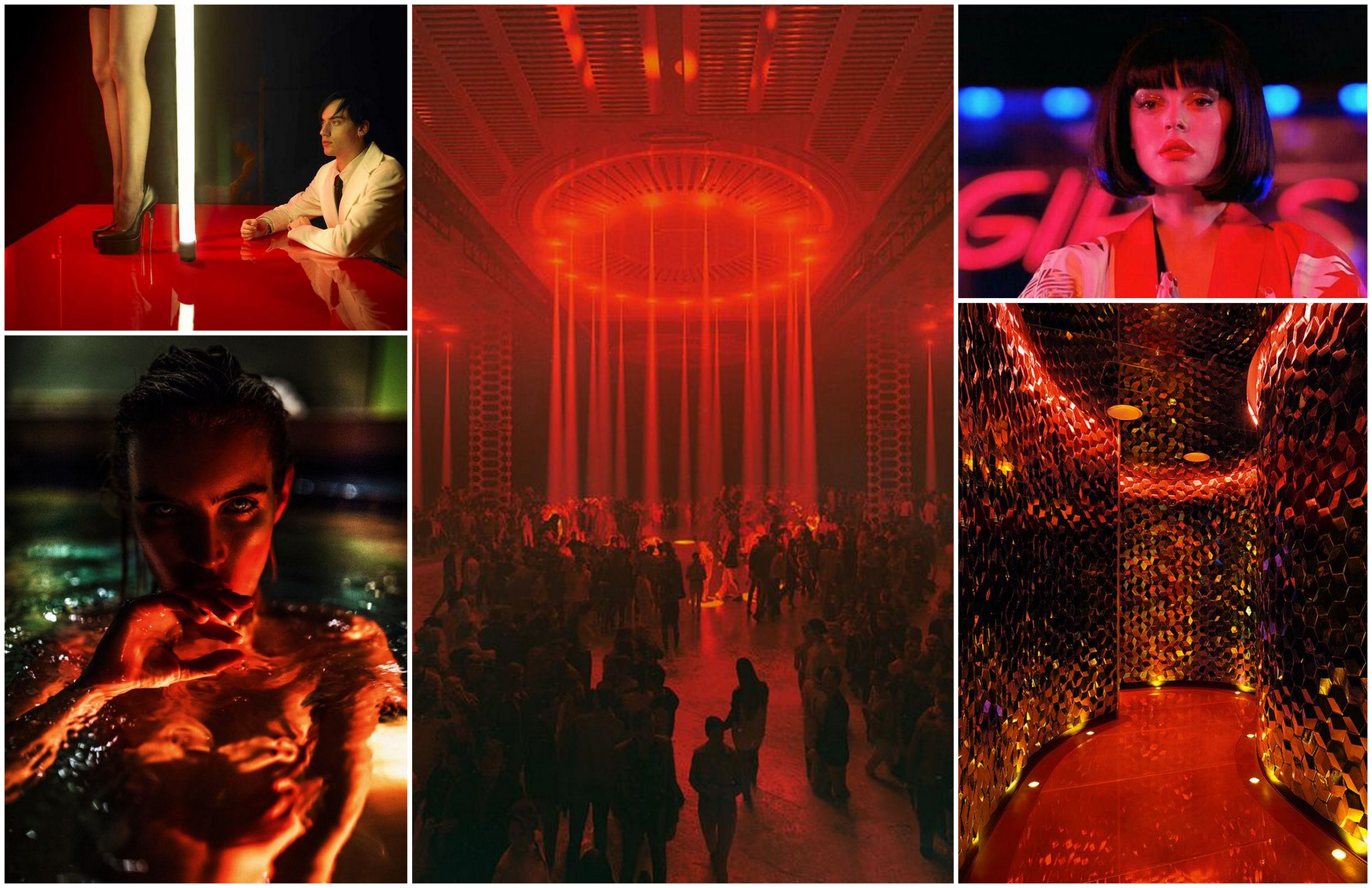
Finding costumes for approximately 500 background actors to party up a storm in Flagg’s New Vegas hot spot was a daunting task that required going to the real Sin City and Los Angeles to find the necessary pieces. “I shopped about 14 hours every day and we had a whole team,” Kekich remembers filling a semi-truck with E-Crates full of clothes. Director Chris Fisher emphasized that “These are real people. We want to create real people. We’re not creating Burning. These are people such as teachers, accountants, lawyers.” Escaping reality is a central component of both the real Vegas and the one Flagg has turned into his kingdom. “We want to create this world where anything could happen. We wanted vibrant colors, working with Aaron Haye, who built this beautiful set of blacks, golds, and reds. It was important that I complimented all this, so I spent a lot of time in Vegas.” A mix of vintage (including ‘60s and ‘70s showgirl costumes) and modern pieces were “combined together to create this world of textures and layers.” In a rare move for the background of this volume “Every single person had a full wardrobe fitting. None of it was done on set.”
Julie Lawry and Lloyd Henreid
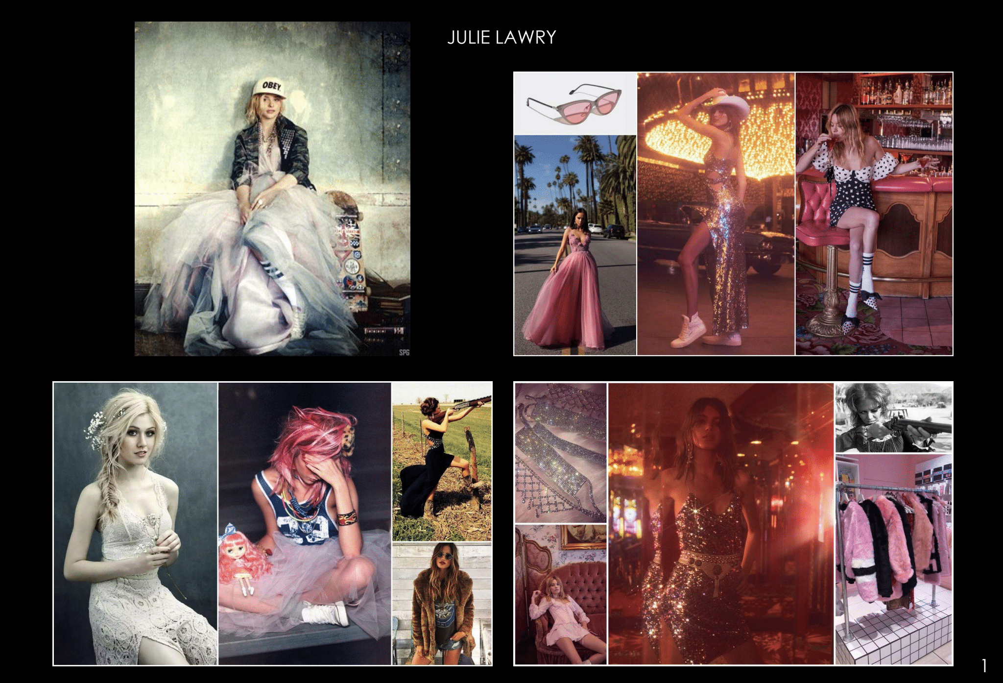
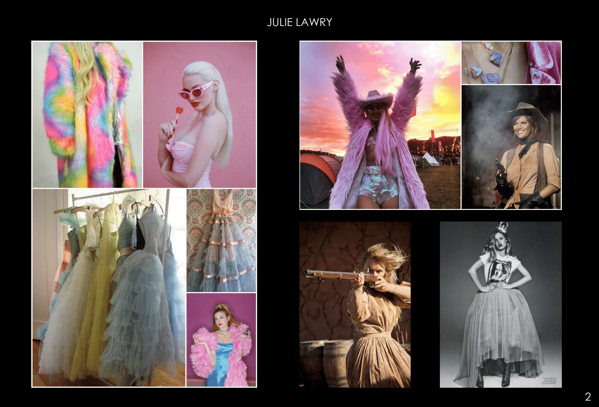
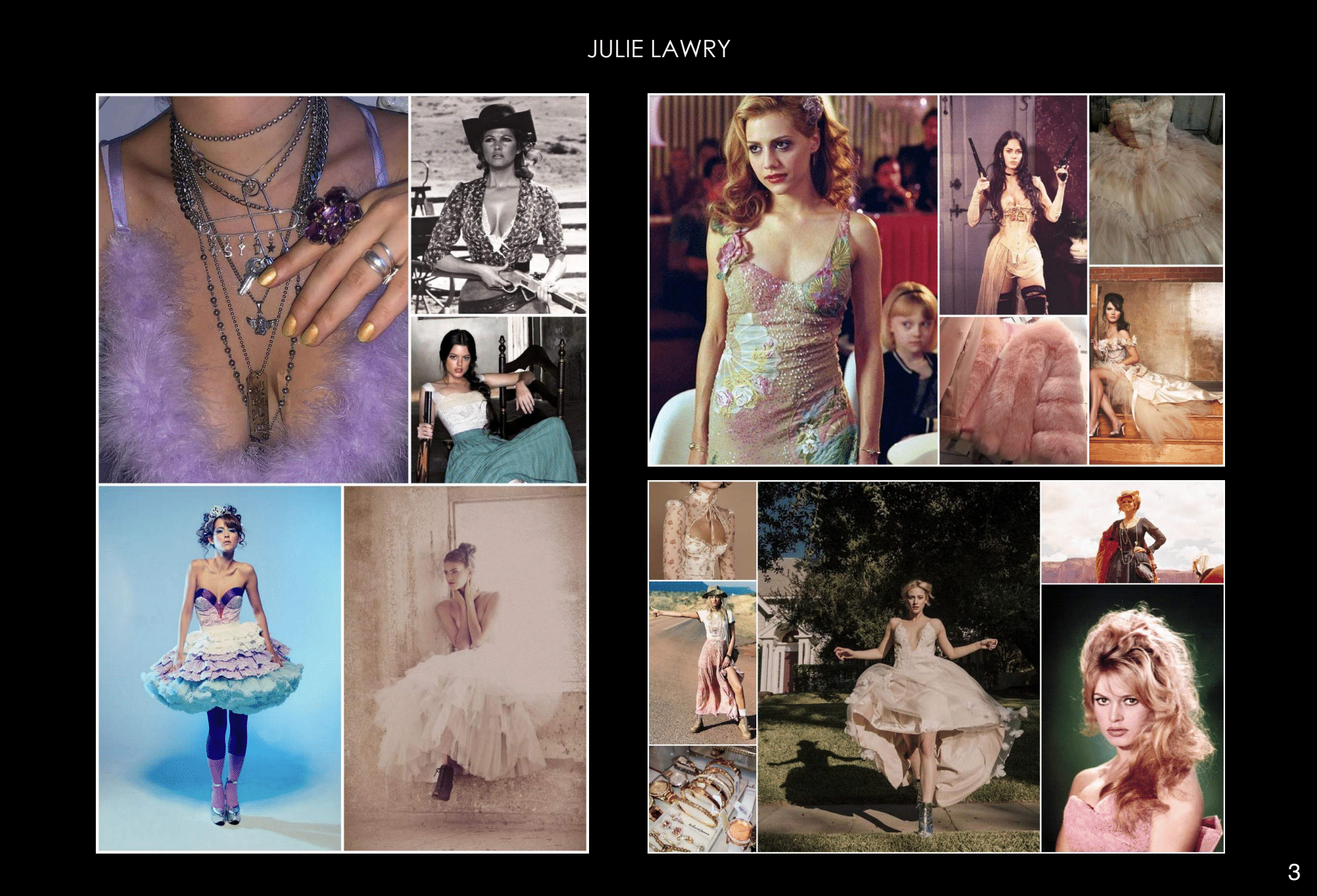

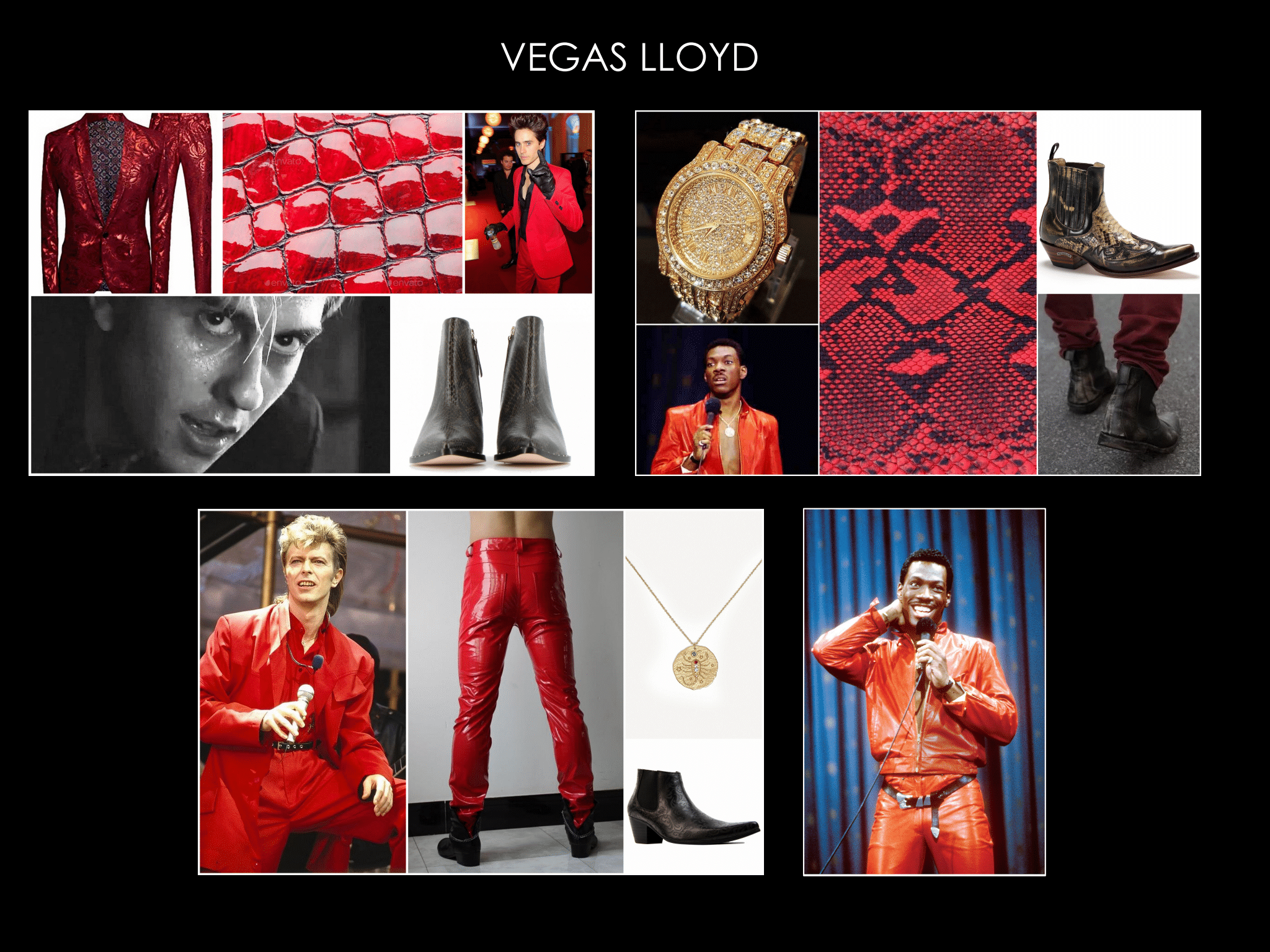
“You take this girl that has a very young feel and then we see all of a sudden, she's been blinded by the love of Flagg and she has a control over men through her sexuality,” explains Kekich about Julie’s (Katherine McNamara) progression from the tulle frock and combat boots to the sleek New Vegas looks. “We take her from this kind of girly girl flamboyant look to this overly sexualized narcissistic, knows that she's beautiful and sexy and can control men through sexual acts," says Kechich. "She's living this ultimate life through desires. Able to wear whatever she wants.”
“The fun thing about a Lloyd and Julie was there so we got to complement one another we did the red tones, we did the pink tones. We found that hair was gonna dye her hair pink,” says Kekich. “Let's do the sequins, let's do the faux furs, let's create a lot of textures.” They had eight or nine rolling racks that actress Namara told Kekich was the "ultimate girl dream."
Rat Woman

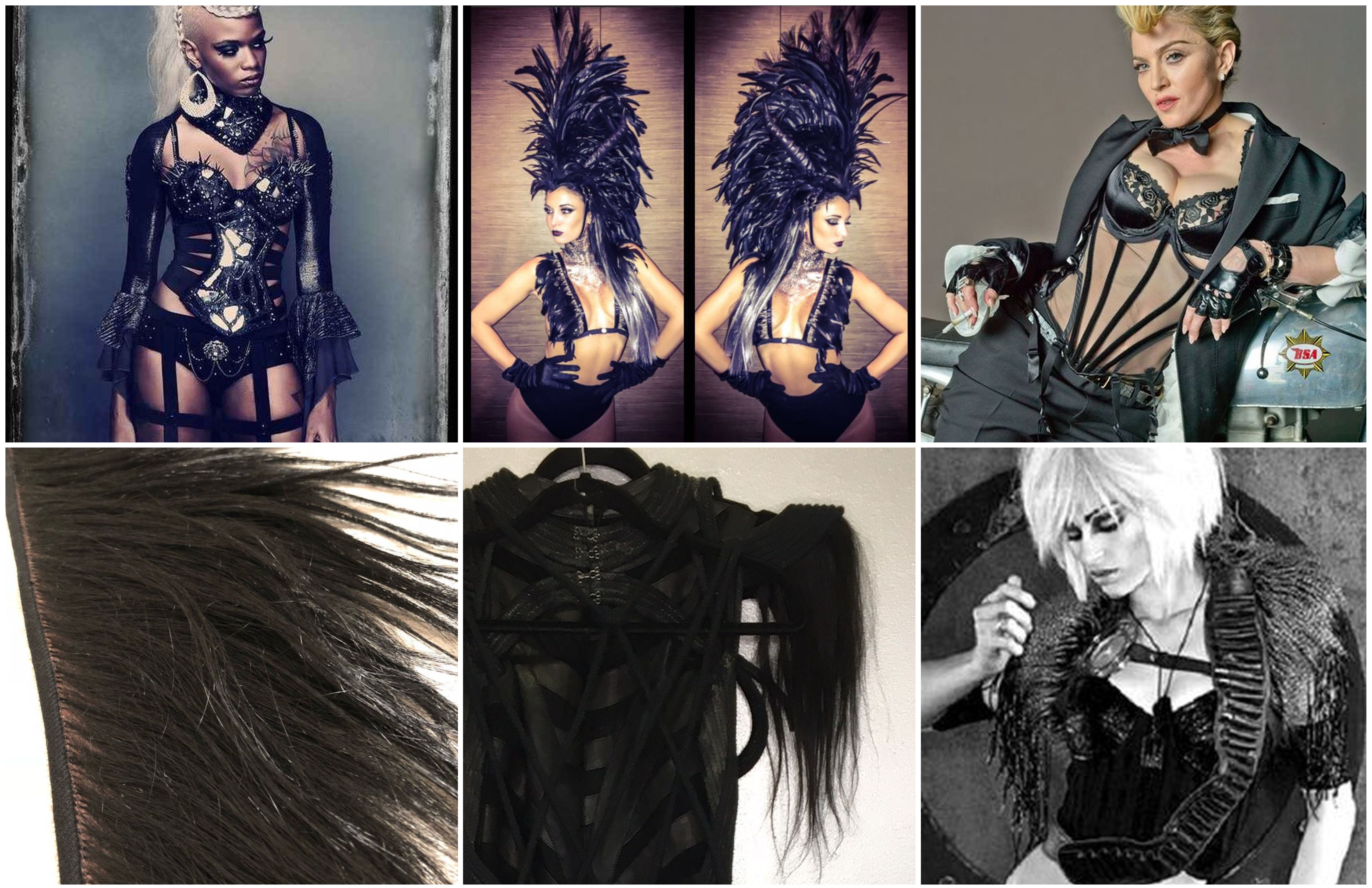
Gender-swapped from both the book and ‘90s adaptation, Rat Man becomes Rat Woman (Fiona Dourif). This character is a ringleader and hosts the main events at the Pink Palace so “It was important we showed that and that she looked different from everybody else.” This is the one character Kekich dialed into the fantasy element and the headpiece was a big element of this. “To me, that represented authority, that represented ringleader. You could see her from any part of the Pink Palace,” adds Kekich. Military Dragoons influenced this authoritative look she was leaning toward and the Melrose situated Cosmo Glam brought his vision to life.
“I started looking through the shop and I found these pieces of roping and human hair, and I was like, “Oh my god, these are pieces that I wanted,” she says. “So I ended up getting these beautiful art pieces.” The work wasn’t over as it had to be built onto a bodice. Working closely with Dourif they had to test out how she could move in the 20 lb headpiece that consists of around 10,000 feathers. On set, Dourif also required support, “We had a team of three people with her, so every time when we cut, we took it off, boom, hair, makeup, and then three people to re-help put the pieces together.”
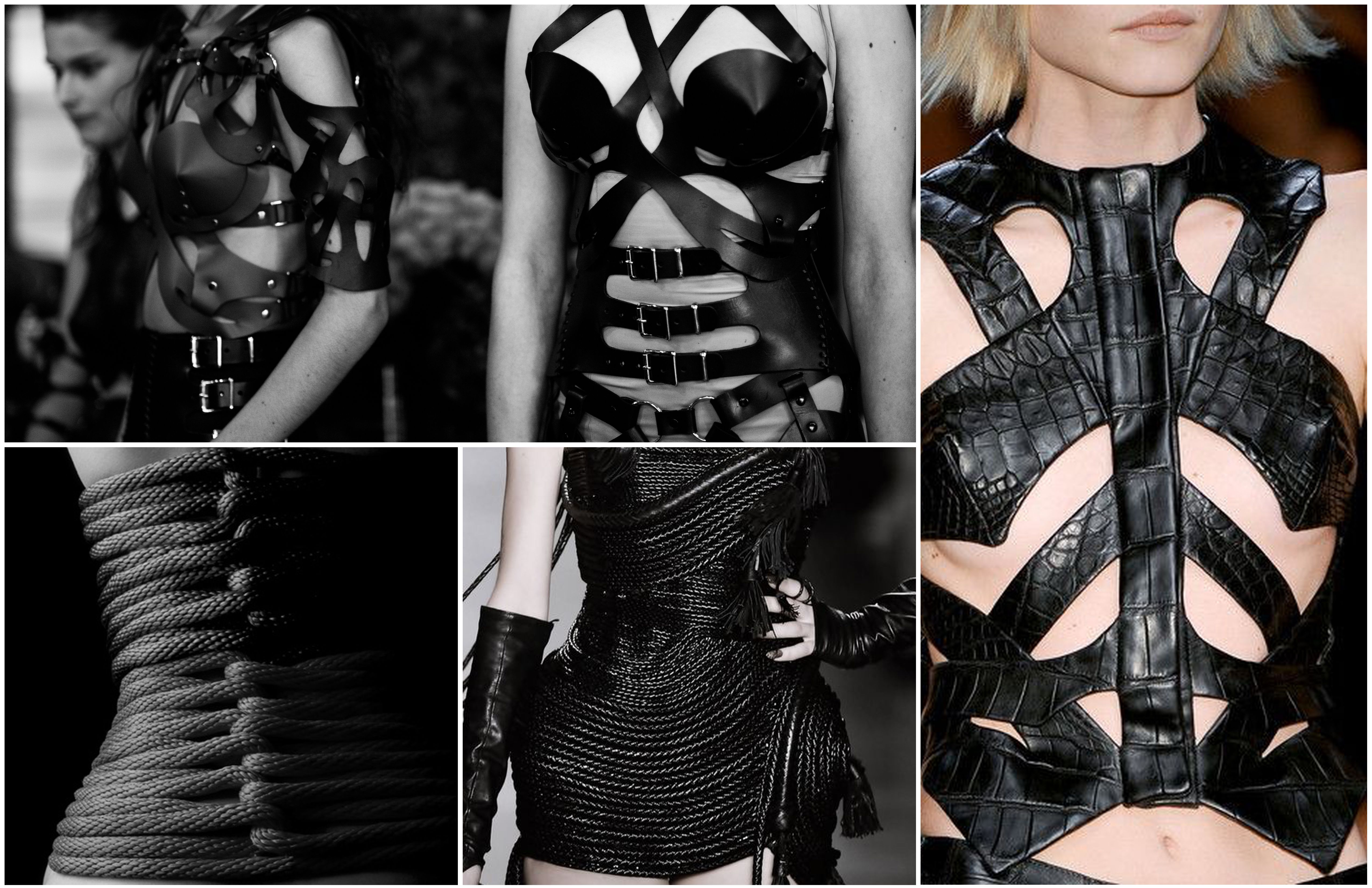
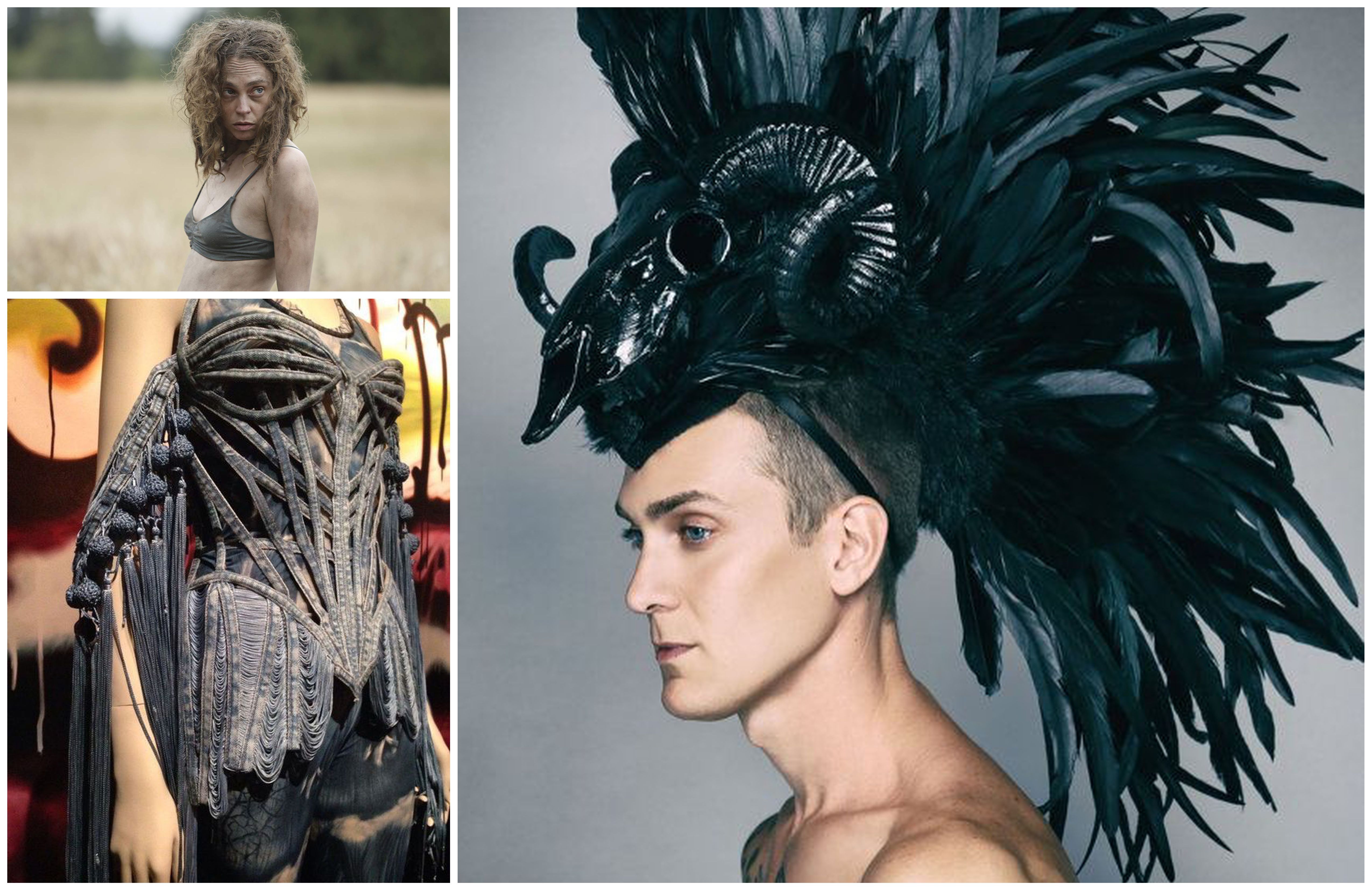
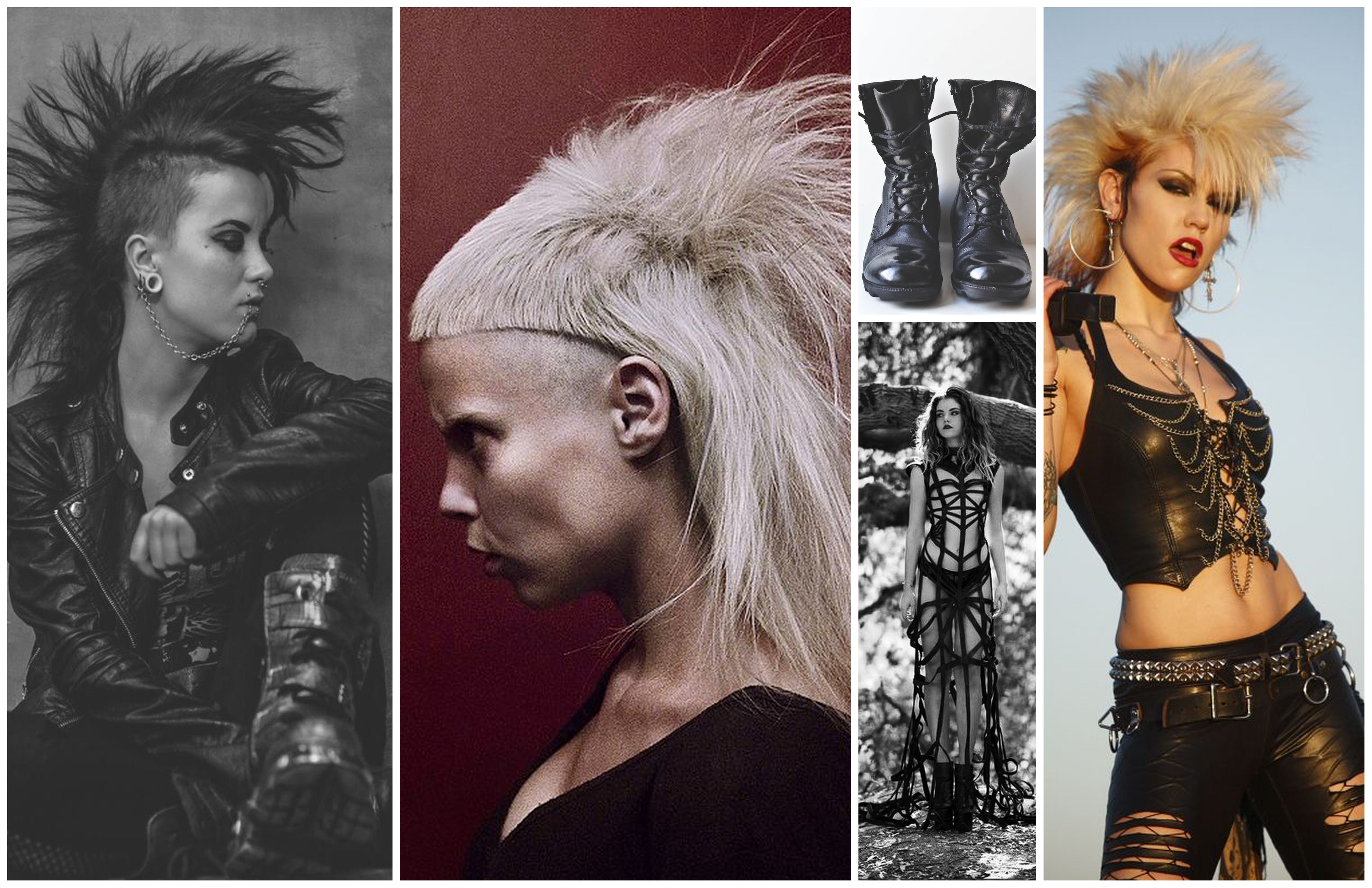
In Episode 6, Rat Woman wears a 1940s vintage beaded garmented that Kekich bought in Los Angles at a vintage couture private show, “I brought it back to a beader I hired in Vancouver, who rebeaded the whole thing over two weeks.” Jean Paul Gauthier was a big inspiration and Kekich teased another stunning look that has yet to be unveiled.
Trashcan Man
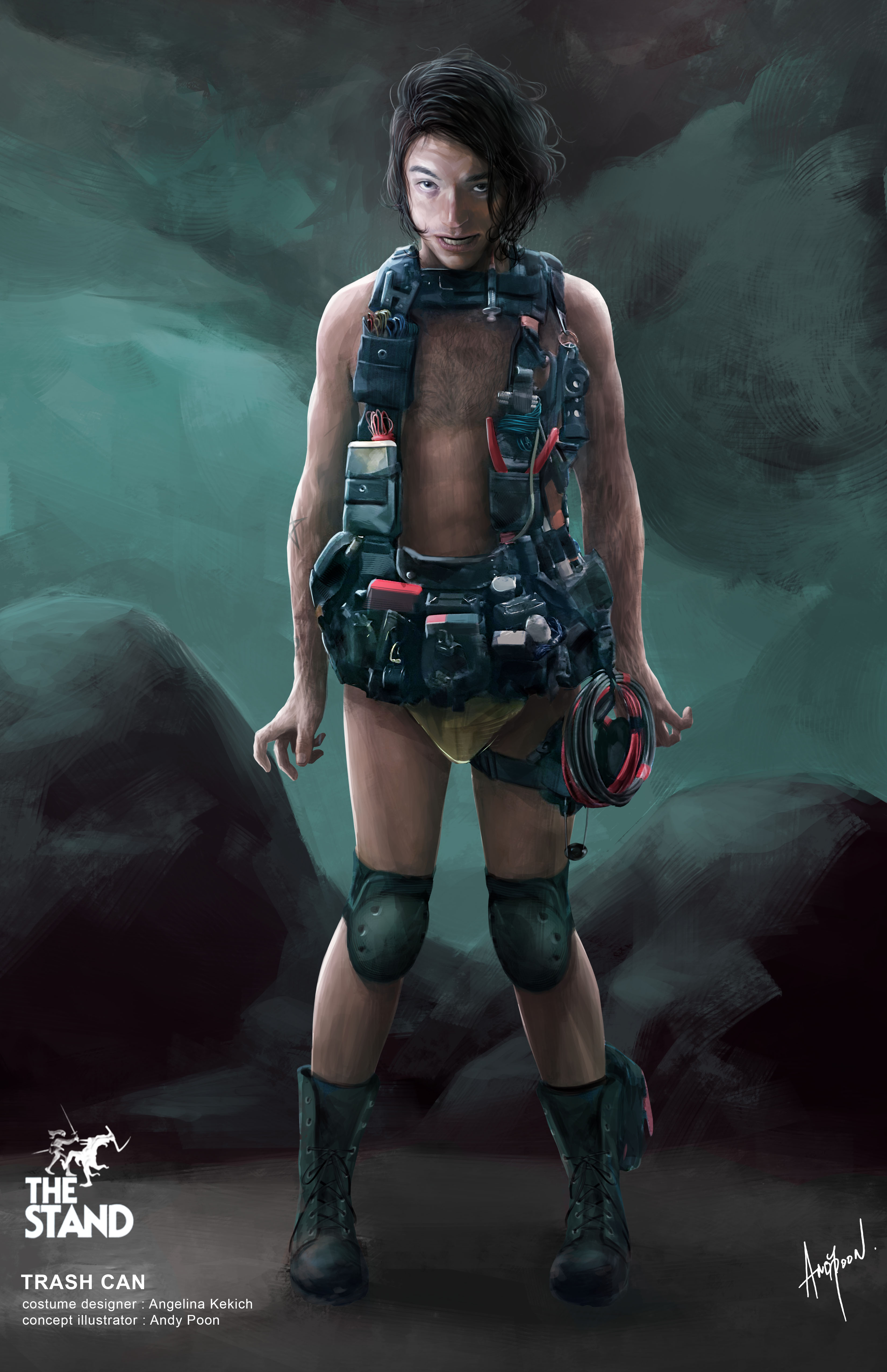
“The Vigil” introduced Trashcan Man (Ezra Miller), a character whose costume is meant to look like he made it himself. The actor is a huge fan of King, and the designer explained how closely she worked with Miller on creating this look. “Ezra said to me ‘Angelina, the number one point that we have to remember is that Trashcan serves fire. He does not serve Flagg. He lives for fire, and whatever is on his body must make sense.’” Everything that he wears has a purpose, including Kevlar underwear to protect his skin. Kekich points out an Easter egg on the back of his utility vest is the numbers from his prison uniform. “Ezra took a piece of the fabric from the prison uniform and did the artwork on the back with the numbers that was hand-stitched,” she describes. “So it very much had to have a very organic feel to the costume and feel right for what he's doing.”.
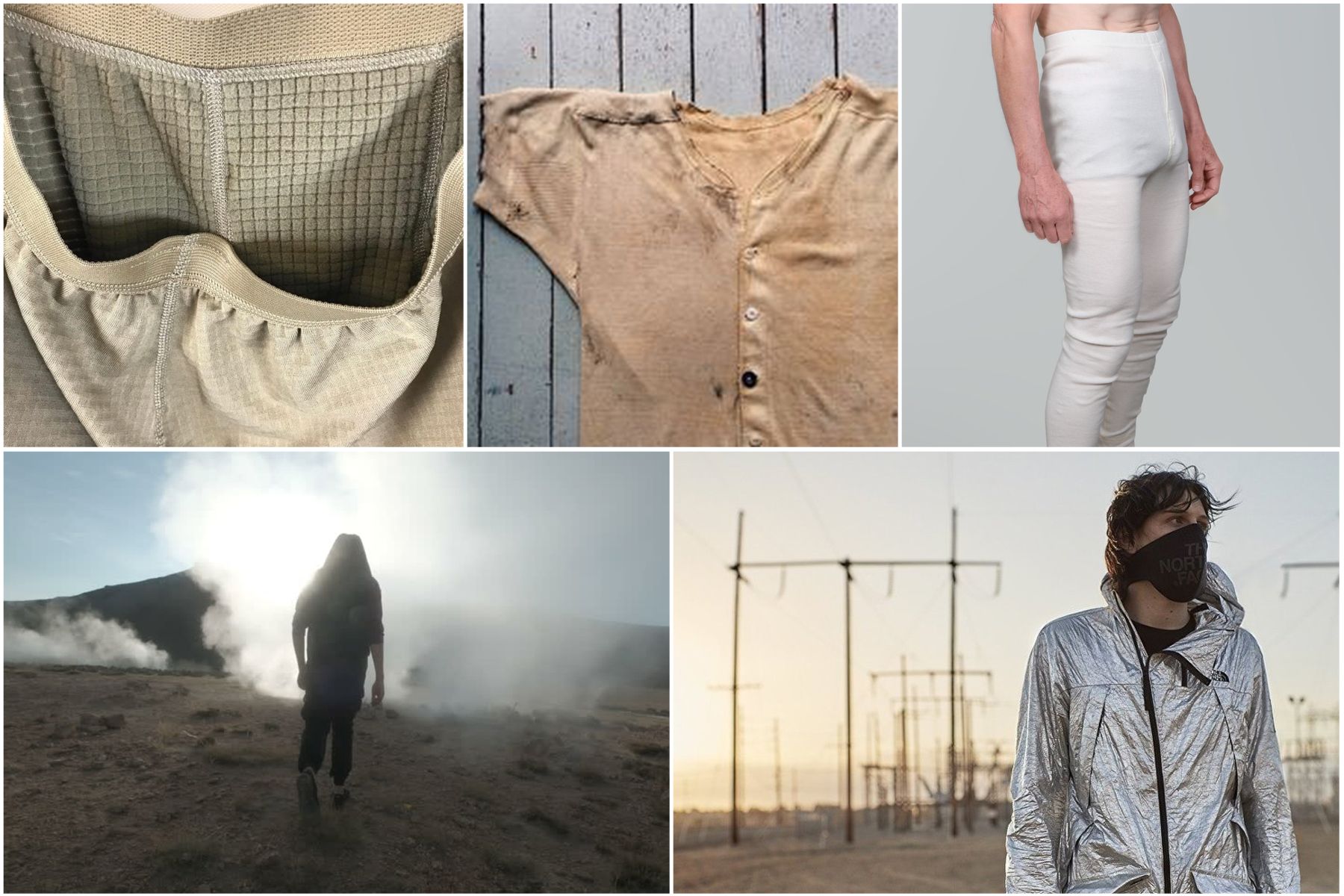
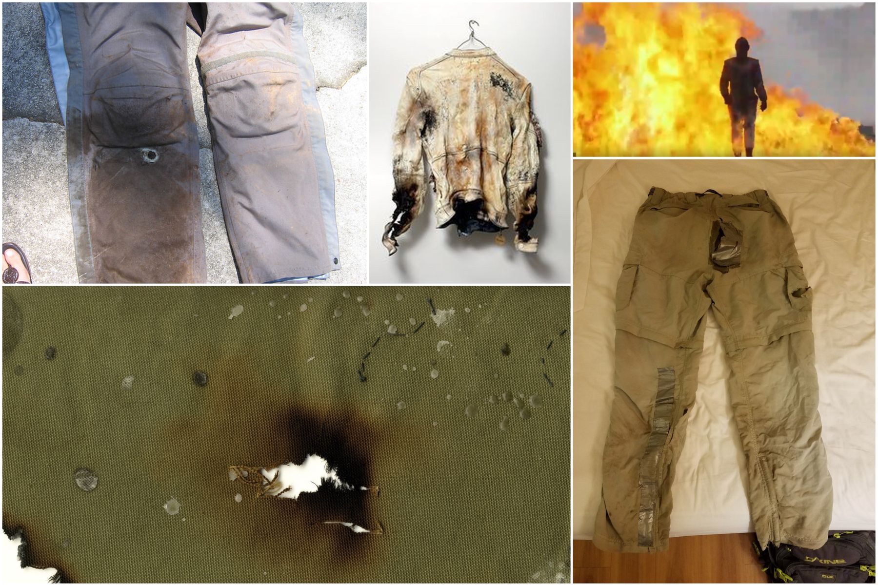
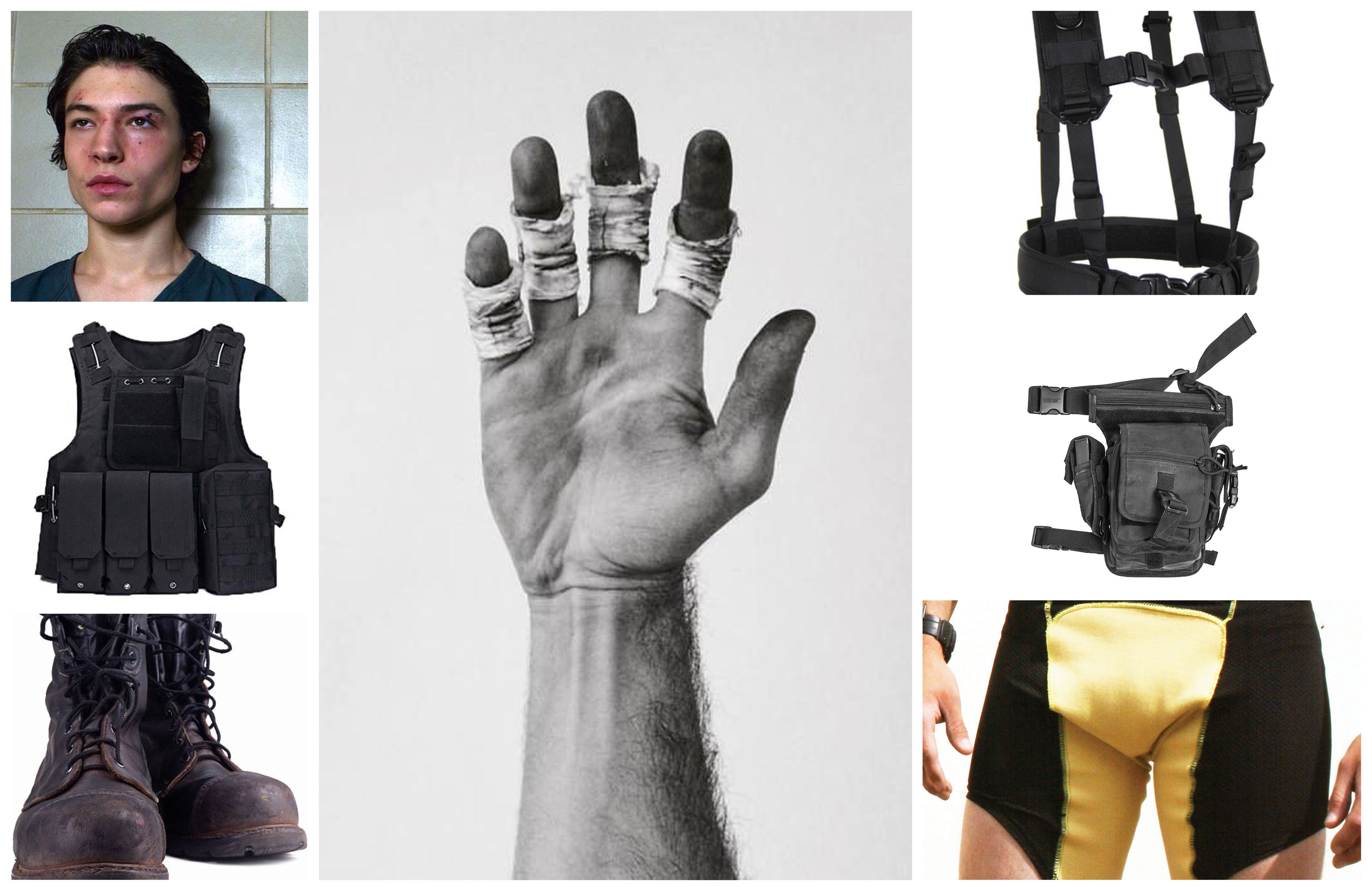
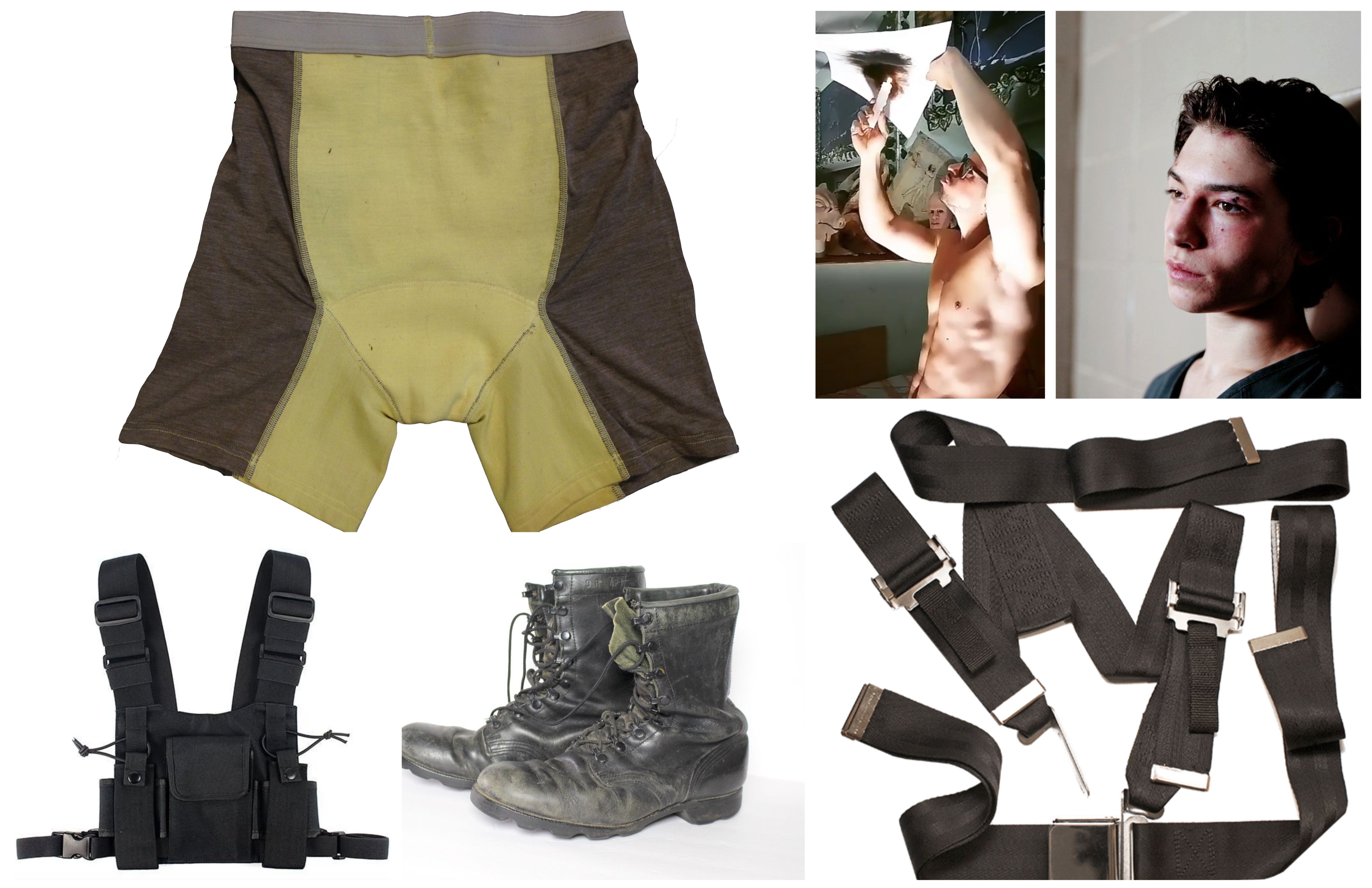
Kekich spoke of this Miller’s artistic talents, as well as his method acting. “We spent weeks and weeks working together, and we would be adding stuff taking stuff off, and to the point where once Ezra arrived he completely went into method acting.” As with all the costumes, the designer wanted to make sure the garments didn’t resemble the work from the 1994 version, "We did not want to create something that's already been created and we wanted something that felt like a piece of art that he's created around his body.”
Emma Fraser spends most of her time writing about TV, fashion, and costume design; Dana Scully is the reason she loves a pantsuit. Words can also be found at Vulture, Elle, Primetimer, Collider, Little White Lies, Observer, and Girls on Tops. Emma has a Master’s in Film and Television, started a (defunct) blog that mainly focused on Mad Men in 2010, and has been getting paid to write about TV since 2015. It goes back way further as she got her big start making observations in her diary about My So-Called Life’s Angela Chase (and her style) at 14.


